10 Analyzing media data
The previous chapter measured what marketing did. This one steps back to the raw material that a good deal of that marketing is trying to influence: how many people the club actually reaches through its broadcasts and streams. For most clubs, media is not a side channel; media rights are one of the largest revenue lines on the books, often rivaling or exceeding ticketing. The people who sell advertising, negotiate carriage, and set streaming strategy live and die by audience numbers. An analyst who can read those numbers, aggregate them correctly, and explain what they do and do not mean is immediately useful.
This is a lighter chapter than the ones before it. There is no model to fit and no algorithm to tune. Media data rewards a different skill: knowing what each number is, because the metrics are easy to misread and even easier to add up wrong. We will look at the two kinds of media data almost every club now handles, traditional linear-television ratings from Nielsen and direct-to-consumer (DTC) streaming and subscription data. For each we will cover the same three things: what the data means, how to aggregate it, and how to interpret it.
Throughout, the SQL examples show how you would pull and roll up the data in a warehouse, where it usually lives; the R examples run the same logic live against simulated data in the FOSBAAS package so you can see the numbers. The two are interchangeable in spirit: a GROUP BY in SQL and a group_by() in dplyr are the same idea.
10.1 Two different worlds
Linear television and streaming feel like the same business (people watching a ball game), but the data could hardly be more different, and the difference explains most of the confusion analysts run into.
Nielsen data is a panel estimate. Nielsen never sees most viewers. It meters a carefully chosen sample of households and projects the sample up to the whole market, so every number you receive is an estimate with sampling error attached, delivered on a lag and bounded to a geographic market. It is indirect, but it is the common currency: advertisers, networks, and leagues have agreed to price and compare audiences in Nielsen’s terms for decades.
DTC data is a census of your own platform. When someone streams a game through the club’s own product, the platform logs it: the device, the location, the minutes watched, the subscription behind it. There is no sampling and no projection; you have the actual records for everyone who uses the product. That sounds strictly better, and in some ways it is, but it comes with its own limits: it only covers people who use your product, the data is fragmented across platforms, and the most important pieces are often owned by the league rather than the club.
| Dimension | Linear (Nielsen) | Direct-to-consumer |
|---|---|---|
| Measurement | Panel sample, projected | Census (every session logged) |
| Unit of analysis | Household / person | User / device |
| Coverage | One market (DMA) | Anywhere the product is sold |
| Timeliness | Delayed, sometimes revised | Near real time |
| Primary use | Ad sales, cross-network comparison | Product, retention, engagement |
Neither is the whole picture. A fan who watches on the regional cable channel shows up in Nielsen but not in your stream; a fan who cut the cord shows up in your stream but not in Nielsen; a fan watching in a bar shows up cleanly in neither. Media measurement is a patchwork, and the honest analyst keeps that in mind before summing anything.
10.2 Linear television: Nielsen data
10.2.1 What the numbers describe
Nielsen measures television in a few nested quantities, and every headline metric is built from them. Start with the universe: the total number of television households in a market, sometimes called the universe estimate or UE. Of those, some fraction has a set on at any given moment; that is HUT, households using television. And of the households using television, some are tuned to the telecast you care about; that is the audience.
Measurement happens in quarter-hours. A three-hour baseball broadcast is a sequence of roughly twelve quarter-hour observations, each with its own audience, and the metrics you report are built by aggregating across them. The data also carries the market (a DMA, or designated market area), the program, and a telecast identifier for each individual broadcast.
The broadcast_ratings_data set in FOSBAAS is one simulated season of the club’s regional broadcasts, delivered at exactly this grain (a telecast, in a market, quarter-hour by quarter-hour), so we can build the metrics ourselves.
ratings <- FOSBAAS::broadcast_ratings_data
kable(head(ratings),
      caption = "Nielsen-style ratings at the telecast x market x quarter-hour grain.",
align = "c", format = "markdown", padding = 0)| broadcastDate | program | market | telecastId | quarterHour | tvHouseholds | hutHouseholds | viewingHouseholds |
|---|---|---|---|---|---|---|---|
| 2024-04-04 | GAME HENS BASEBALL | Chattanooga | 601 | 1 | 370000 | 190134 | 5479 |
| 2024-04-04 | GAME HENS BASEBALL | Chattanooga | 601 | 2 | 370000 | 170546 | 6181 |
| 2024-04-04 | GAME HENS BASEBALL | Chattanooga | 601 | 3 | 370000 | 169295 | 6659 |
| 2024-04-04 | GAME HENS BASEBALL | Chattanooga | 601 | 4 | 370000 | 178745 | 7679 |
| 2024-04-04 | GAME HENS BASEBALL | Chattanooga | 601 | 5 | 370000 | 176179 | 8944 |
| 2024-04-04 | GAME HENS BASEBALL | Chattanooga | 601 | 6 | 370000 | 161612 | 6178 |
Each row gives the three quantities we need: tvHouseholds (the universe), hutHouseholds (households using television that quarter-hour), and viewingHouseholds (households tuned to this telecast that quarter-hour). Because a telecast spans many quarter-hours, the audience rises and falls within a single broadcast: sparse early, building through the middle innings, tapering at the end (Figure 10.1). That is exactly why the metrics are averages over quarter-hours rather than a single number.
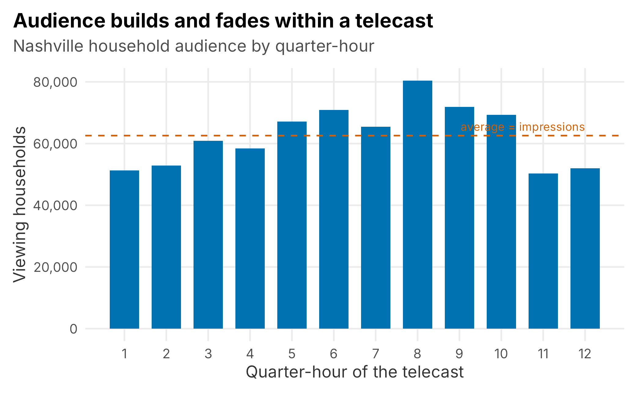
Figure 10.1: Household audience across the quarter-hours of one Nashville telecast. The reported audience is the average of these observations, shown as the dashed line.
10.2.2 Understanding Nielsen metrics
Nielsen reporting is confusing for a specific reason: it tends to use normalized ratios in place of the raw counts they come from, and it labels them with terse, overloaded column names. When you read a report it pays to keep the definitions close and map each number back to what it actually counts. Our simulated data spells the quantities out (viewingHouseholds, hutHouseholds, tvHouseholds), but a real extract gives you the shorthand below, and the same terms recur for households and for persons.
-
IMP (impressions). The estimated number of people (or households) viewing the program, expressed in units, tens, hundreds, or thousands. In a metered market it is extrapolated from the sample of metered homes. (Our
viewingHouseholdsis the per-quarter-hour version of this.) -
UE / SOW. The Universe Estimate is the total number of households, and persons 2+, within the specified characteristic, the denominator behind a rating. The Sum of Weights estimates the number of people (in thousands) in the demographic and geography, and Nielsen computes it for the requested daypart, so not every row in a report shares the same SOW. (Our
tvHouseholdsplays the UE role.) - HUT / PUT % (X.X). Households Using Television (or Persons Using Television) percent: the share of all TV households (or persons) in a geography with a set in use during the period. Because a household watching two programs at once is counted toward each program’s rating but only once toward HUT, the summed ratings for a period can exceed the HUT number. Formula: (sum of HUT impressions / sum of weights) × 100. The rating can be carried to one, two, or three decimals.
-
HUT / PUT IMP. The count of households or persons using television at that time, the number of people watching anything. (Our
hutHouseholds.) - RTG % (X.X). Formula: (impressions / sum of weights) × 100. The estimated percentage of the universe of TV households (or other specified group) tuned to the program.
- SHR % (share). Formula: (impressions / HUT-or-PUT impressions) × 100. The percentage of those using television who are tuned to a specific program, station, or network. Across all programming in a market, shares sum to roughly 100.
The thing to internalize is that a rating and a share are the same impressions count divided by different denominators: the whole universe for a rating, only the in-use sets for a share. Nielsen’s “sum of weights” is just that universe estimate for the requested group, and “HUT/PUT impressions” the in-use count, so the glossary formulas above and the equations in the next section are the same two ratios in different clothing. Everything else is bookkeeping about which households or persons, in which geography, over which daypart. The next section builds those two ratios from our data.
10.2.3 The three metrics
Three numbers do almost all the work in linear television, and they are all ratios of the quantities above.
Impressions are the average audience across the telecast, the number of households (or people) watching at an average moment.
\[\begin{equation} \text{impressions} = \frac{1}{Q}\sum_{q=1}^{Q}\text{audience}_q \tag{10.1} \end{equation}\]
Rating expresses that average audience as a percentage of the whole universe: everyone who could have watched, whether their television was on or not.
\[\begin{equation} \text{rating} = \frac{\text{impressions}}{\text{universe}} \times 100 \tag{10.2} \end{equation}\]
Share expresses it as a percentage of only the households using television at the time.
The distinction between rating and share is the single most important idea in the chapter. A rating answers “what fraction of everyone are we reaching?” A share answers “of the people watching something, what fraction chose us?” Because the households using television are always a subset of the universe, share is always larger than rating. A late-night game might post a small rating simply because most people are asleep, yet win a large share because nearly everyone still awake and watching TV is watching the game. Ratings reward absolute reach; share rewards competitive dominance of the available audience.
10.2.4 Aggregating from quarter-hours
The raw data is per quarter-hour, but nobody reports per quarter-hour. The first aggregation collapses each telecast to one row. In the warehouse that is a GROUP BY:
SELECT
  broadcast_date,
  program,
  market,
  telecast_id,
  AVG(viewing_households)                              AS impressions,
  AVG(viewing_households) / AVG(tv_households)  * 100  AS rating,
  AVG(viewing_households) / AVG(hut_households) * 100  AS share
FROM broadcast_ratings
GROUP BY broadcast_date, program, market, telecast_id;
The identical logic in R, which we can actually run:
telecast <- ratings |>
  group_by(broadcastDate, program, market, telecastId) |>
  summarise(impressions = mean(viewingHouseholds),
            rating      = mean(viewingHouseholds) / mean(tvHouseholds)  * 100,
            share       = mean(viewingHouseholds) / mean(hutHouseholds) * 100,
            .groups = "drop")
Note the pattern: audience quantities are averaged across quarter-hours, and only then turned into a rating or share. Averaging the ratios instead would give a subtly different (and wrong) answer. With telecast-level rows in hand, a season summary is one more aggregation. Here is the club’s flagship game broadcast, by market:
by_market <- telecast |>
  filter(program == "GAME HENS BASEBALL") |>
  group_by(market) |>
  summarise(telecasts   = n(),
            impressions = mean(impressions),
            rating      = mean(rating),
            share       = mean(share),
            .groups = "drop") |>
arrange(desc(impressions))| Market | Telecasts | Avg impressions | Avg rating | Avg share |
|---|---|---|---|---|
| Nashville | 60 | 69,006 | 6.00 | 12.82 |
| Memphis | 60 | 11,953 | 1.81 | 3.87 |
| Knoxville | 60 | 11,175 | 2.00 | 4.29 |
| Huntsville | 60 | 8,311 | 1.89 | 4.06 |
| Chattanooga | 60 | 7,678 | 2.08 | 4.45 |
The home market dwarfs the regionals, as expected: Nashville averages about 69,006 households per game, a 6.0 rating and a 12.8 share, while the outlying markets post low single-digit ratings, generally in the one-to-two range. That gap is the whole point of a regional sports network: deep penetration at home, a long thin tail across the footprint.
10.2.5 The trap in rolling up
There is one aggregation you must not do, and it is the most tempting one. Impressions are counts of households, so they add up: the club’s total household reach for a game is the sum of impressions across every market, about 108,121 households on an average night. Ratings and shares are not additive. Each is a percentage against a different denominator (its own market’s universe), so summing them is meaningless and averaging them is misleading. A 6.0 rating in Nashville’s universe of 1,150,000 households and a 2.1 rating in Chattanooga’s 370,000 do not average to anything meaningful; the small market barely moves the real combined figure.
When you genuinely need a single rating-like number across markets, report the audience-weighted figure (total impressions over total universe) or, if you only have the percentages, the median, and label it clearly as a summary rather than a true rating. The safe habit is simple: sum the counts, never the rates. More than one media report has overstated a club’s reach by adding up ratings that were never meant to be added.
10.2.6 Demographics
Advertisers rarely buy “households.” They buy audiences (men 18 to 49, women 25 to 54), so ratings come broken out by demographic, where the counts are persons rather than households and the denominators become persons in the group (personsUniverse) and persons using television (personsUsingTv). The broadcast_demographics_data set gives the home-market game telecast split into age and gender groups.
demo <- FOSBAAS::broadcast_demographics_data
demo_summary <- demo |>
  group_by(demographic) |>
  summarise(impressions = mean(impressions),
            rating      = mean(impressions) / mean(personsUniverse) * 100,
            share       = mean(impressions) / mean(personsUsingTv)  * 100,
            .groups = "drop") |>
arrange(desc(rating))| Demographic | Avg impressions | Avg rating | Avg share |
|---|---|---|---|
| M55+ | 9,126 | 3.80 | 9.77 |
| M35-54 | 7,985 | 3.19 | 8.28 |
| F55+ | 5,804 | 2.11 | 5.44 |
| F35-54 | 4,698 | 1.84 | 4.76 |
| M18-34 | 4,748 | 1.83 | 4.71 |
| F18-34 | 2,972 | 1.12 | 2.88 |
| P2-17 | 2,519 | 0.60 | 1.55 |
The pattern is exactly what a baseball broadcaster expects to see (Figure 10.2): the audience skews older and male. Men 55 and older carry the highest rating, men 35 to 54 close behind, while the persons 2-to-17 group barely registers. That skew is a strategic fact, not a curiosity: it tells the ad-sales team which categories to pitch and the marketing team which audiences the club is failing to reach, which is where growth has to come from.
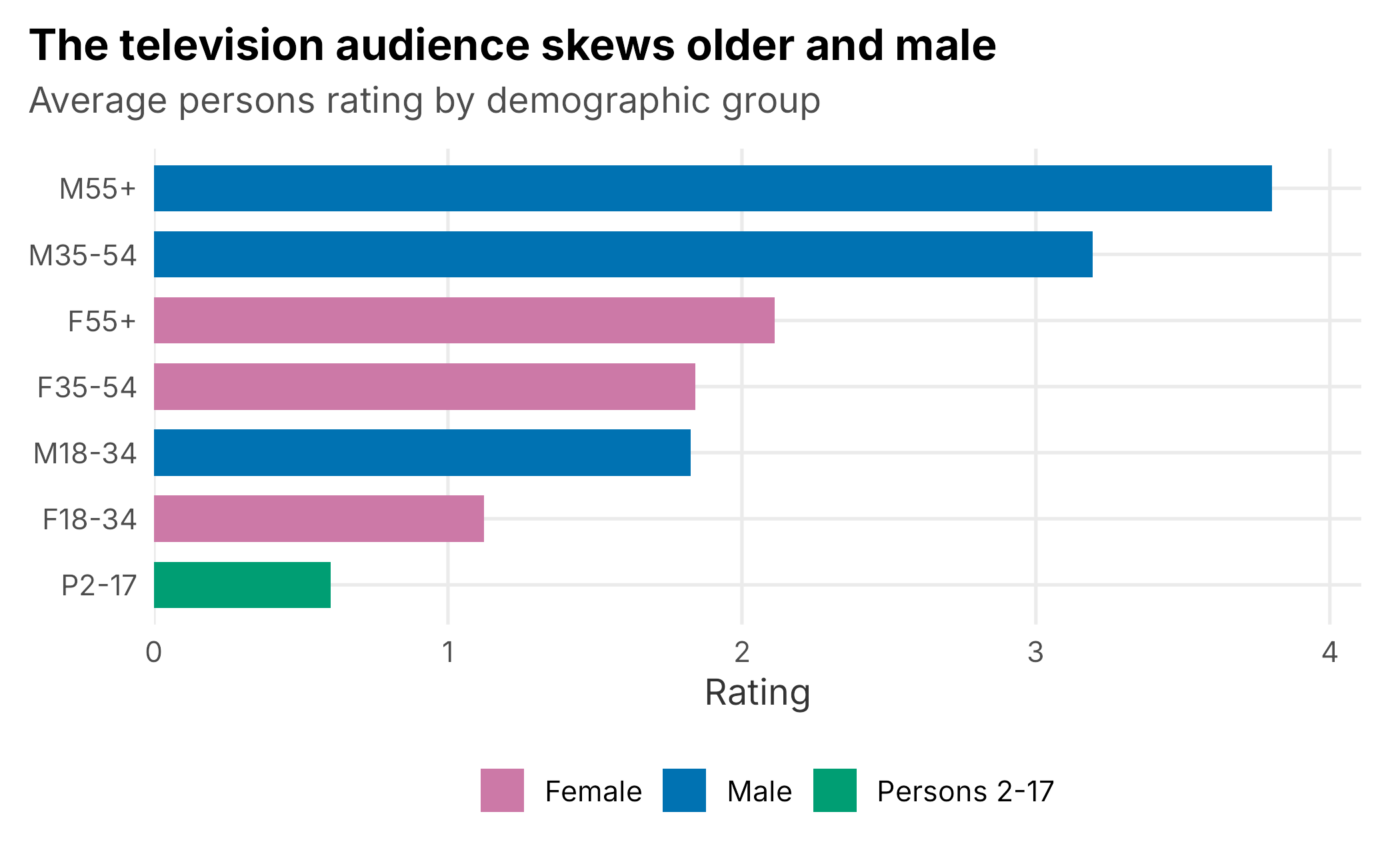
Figure 10.2: Average household-game rating by demographic group. The club’s television audience skews older and male.
One caution carries over from the last section. Demographic impressions add up (you can sum persons across groups to get total persons reached), but the ratings and shares are again percentages against different denominators and cannot be summed. To combine groups, sum the person counts and re-divide by the combined universe.
10.2.7 What linear data is good for, and its limits
Nielsen data is the currency of the advertising business, and that is its great strength: everyone measures the same way, so a club’s audience can be priced against a sitcom’s or a rival club’s. It is credible, comparable, and decades deep.
Its limits follow from being a projected panel. The numbers carry sampling error, so small differences are noise; they arrive on a delay and are sometimes revised; they are bounded to a market, so they cannot see a national or cord-cutting audience; and they tell you how many but almost nothing about who: no names, no accounts, no way to follow a viewer into a purchase. For that, you need data you own.
10.3 Direct-to-consumer
When a club sells its own streaming product, it stops estimating its audience and starts recording it. DTC data comes in two families that answer two different questions. Subscription data is the business: who signed up, who paid, who canceled, and what it is worth. Streaming data is the usage: who actually watched, on what device, for how long, and where. A healthy media practice reads both, because a subscriber who never streams is about to churn, and a heavy streamer who never subscribes is a conversion waiting to happen.
Before the numbers, the caveat that governs all of it: a club’s DTC feed is almost never complete. Sign-ups that happen inside a league-run app, purchases bundled with a cable package, and viewing on partner platforms may never reach the club’s own tables. Treat DTC figures as a firm floor on your directly-owned business, not as the total.
10.3.1 Subscriptions
Subscription systems record transactions, not people, and the transaction type matters enormously. A Charged transaction is a paid activation; Pending is one in flight; Full Refund and Chargeback reverse a sale that already happened. The metric you report depends entirely on which types you count.
Gross subscriptions count the charged activations, every sale you made. Net subscriptions subtract the reversals (refunds and chargebacks) to reflect the sales that actually stuck. The gap between them is a real business signal: a rising gross with a widening reversal gap means you are selling subscriptions that do not last. In SQL the two are conditional sums:
SELECT
  product,
  SUM(CASE WHEN transaction_type = 'Charged' THEN quantity END) AS gross_subs,
  SUM(CASE WHEN transaction_type = 'Charged' THEN quantity END)
    - SUM(CASE WHEN transaction_type IN ('Full Refund', 'Chargeback')
               THEN quantity END)                                AS net_subs,
  SUM(CASE WHEN transaction_type = 'Charged' THEN revenue END)   AS gross_revenue,
  SUM(CASE WHEN transaction_type = 'Charged' THEN revenue END)
    / SUM(CASE WHEN transaction_type = 'Charged' THEN quantity END) AS arpu
FROM subscriptions
GROUP BY product;
The same summary in R, from the subscription_data set:
subs <- FOSBAAS::subscription_data
subs_summary <- subs |>
  group_by(product) |>
  summarise(
    gross_subs    = sum(quantity[transactionType == "Charged"]),
    reversals     = sum(quantity[transactionType %in% c("Full Refund", "Chargeback")]),
    net_subs      = gross_subs - reversals,
    gross_revenue = sum(revenue[transactionType == "Charged"]),
    arpu          = gross_revenue / gross_subs,
    .groups = "drop") |>
arrange(desc(gross_revenue))| Product | Gross subs | Net subs | Gross revenue | ARPU |
|---|---|---|---|---|
| League Bundle | 9,665 | 9,210 | $1,449,653 | $149.99 |
| Team Stream Annual | 6,274 | 5,989 | $815,557 | $129.99 |
| Team Stream Monthly | 28,909 | 27,463 | $577,891 | $19.99 |
Two numbers deserve attention. The last column is ARPU (average revenue per user, charged revenue over charged subscriptions), which for a single product is just its price, but blended across products is a genuine mix metric: about $63.39 here, pulled up by the annual and bundle products and down by the cheap monthly one. Watching blended ARPU tells you whether your growth is coming from high-value or low-value plans. And the reversal rate (roughly 5% of charged subscriptions come back as refunds or chargebacks) is the quiet drag on every gross number.
A single snapshot hides the story that DTC subscription data tells best: timing. Plotting cumulative net subscriptions over the season shows the shape of demand: a slow offseason, a steep climb into opening day, and a gentler accumulation through the summer (Figure 10.3).
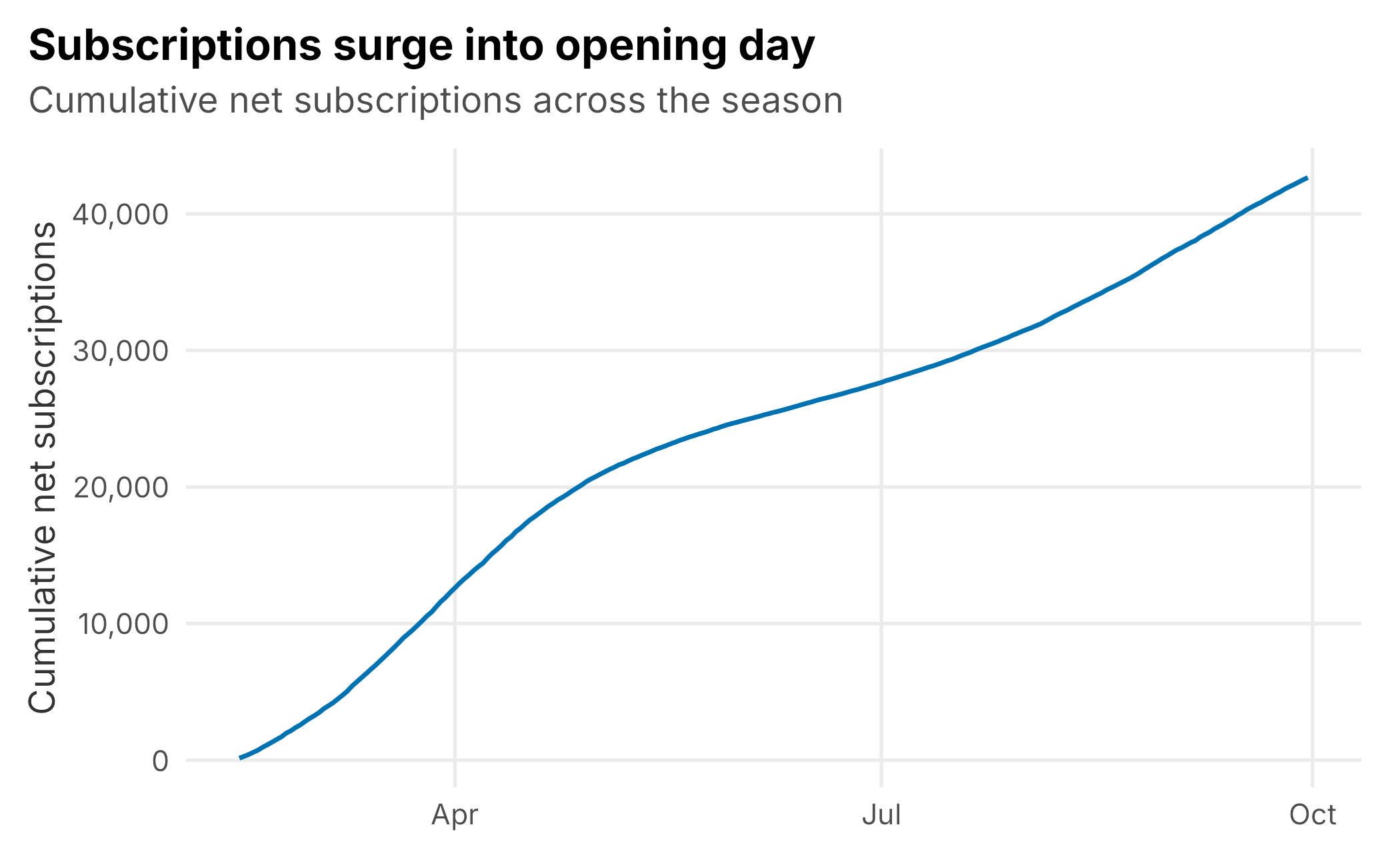
Figure 10.3: Cumulative net subscriptions over the season. Sign-ups surge into opening day, then accumulate more slowly.
10.3.2 Streaming and engagement
Streaming data measures behavior, and it separates two things ticket-style “attendance” thinking tends to conflate: reach, how many distinct people watched, and depth, how long each of them stayed. The streaming_data set records both, per game, split by market type and device.
stream <- FOSBAAS::streaming_data
by_market_dev <- stream |>
  group_by(marketType, deviceType) |>
  summarise(users   = sum(uniqueUsers),
            minutes = sum(minutesStreamed),
            .groups = "drop") |>
  mutate(min_per_user = minutes / users)
The corresponding SQL is again a plain grouped aggregation with a ratio at the end:
SELECT
  market_type,
  device_type,
  SUM(unique_users)                             AS users,
  SUM(minutes_streamed)                         AS minutes,
  SUM(minutes_streamed) / SUM(unique_users)     AS min_per_user
FROM streaming
GROUP BY market_type, device_type;
Two patterns jump out, and both are strategic. First, out-of-market viewers dominate, about 2.4 times the in-market audience (Figure 10.4). The most likely explanation is the in-market blackout: fans inside the market can watch on the regional cable channel, so the ones who turn to the stream are disproportionately the displaced fans scattered across the country. The DTC product is, in large part, how a club serves its diaspora. Second, engagement varies sharply by device. Connected televisions carry both the most viewers and the deepest sessions: about 113 minutes per user against roughly 53 on mobile. A connected-TV viewer is leaning back and watching the game; a mobile viewer is often checking in. Reach and depth are different products, and confusing them leads to bad decisions about where to invest.
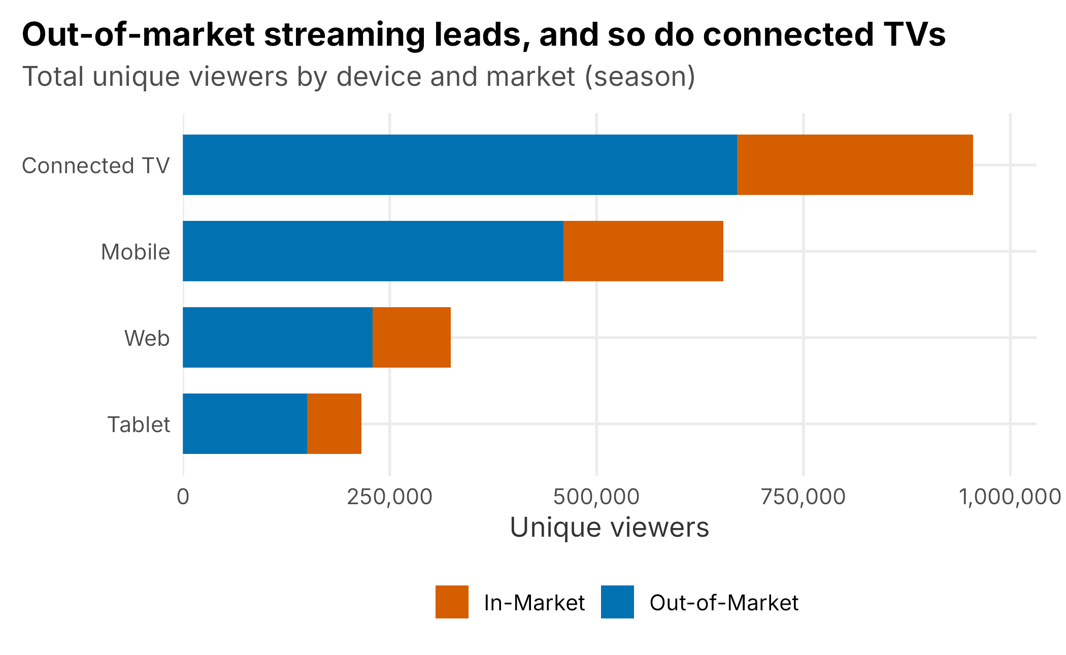
Figure 10.4: Unique streaming viewers by device, split by market. Out-of-market viewers dominate, and connected TVs lead.
One counting subtlety matters here. Unique users are distinct within a slice (within a market and device), so the same person who watches on a phone and a living-room TV is counted in both device rows. That is why you cannot sum uniqueUsers across devices and call it “unique people”: the sum double-counts anyone on more than one device. It is the streaming version of the “never sum the rates” rule from the Nielsen section: always know what your distinct count is distinct over.
10.3.3 What DTC data is good for, and its limits
DTC data is everything Nielsen is not: a census rather than a sample, individual-level rather than projected, national in reach yet located down to the state, near real time, and, crucially, yours, tied to accounts you can email, retain, and convert. It is the right tool for product, engagement, and retention questions.
Its limits are the mirror image of its strengths. It only sees your own product, so it says nothing about the fan on cable or a partner app; it is fragmented across platforms and devices in ways that make clean counting hard; the most valuable slice is often locked inside league-owned systems; and because it is not Nielsen, it cannot be compared to the rest of the television market or sold in the same currency. DTC tells you about your relationship with the fans you have. It does not tell you your share of all the fans there are.
10.4 Key concepts and chapter summary
Media data is two partial views of the same audience, and the analyst’s job is to read each in its own terms and resist merging them carelessly.
- Linear television is a projected panel; DTC is a census. One estimates a whole market from a sample; the other logs your own product exactly. Their strengths and blind spots are opposites.
- Rating versus share is the core distinction. Rating is audience over the whole universe; share is audience over the households actually watching television. Share is always the larger number, and it measures competitive dominance rather than absolute reach.
- Aggregate audience counts, never rates. Impressions and person counts add up across markets and groups; ratings and shares are percentages against different denominators and must never be summed.
- Gross versus net is the subscription version of the same care. Count charged activations for gross, subtract reversals for net, and watch blended ARPU to see whether growth is high-value or low-value.
- Streaming separates reach from depth. Unique users measure how many watched; minutes per user measure how long. Out-of-market and connected-TV patterns carry real strategy, and unique counts are only unique within their slice.
None of this required a model, which is the lesson in itself: a great deal of valuable media analysis is simply knowing what a number means and aggregating it honestly. Chapter 11 turns from data the club already collects to information it must go out and gather deliberately, through formal research methods: survey design, hypothesis testing, and the sampling decisions that determine whether any of it can be trusted.