6 Pricing and forecasting
Like segmentation, pricing could fill a book on its own. It touches willingness to pay, arbitrage, cannibalization, margins, marketing channels, the product suite, brand, and competing internal goals. This chapter follows the segmentation chapter on purpose: pricing is dynamic, and the value of a product changes with who wants it and when. But pricing is often not deliberate at all. Robert Phillips puts it well in Pricing and Revenue Optimization (Phillips 2005):
“In many cases, the prices charged to customers are the result of a large number of uncoordinated and arbitrary decisions.”
— Robert L. Phillips
That is true more often than anyone likes to admit. Price is a core part of the marketing mix, but how it interacts with promotions and other efforts is rarely well understood (we return to this in Chapter 8). Brand sits underneath all of it. Marketers reach for lower prices as a blunt instrument to move tickets, which can backfire over time. The impulse is also backwards: lower prices do the least when a team is losing, and there is little pressure to cut them when a team is winning. Your brand is shaped by price, and because season-ticket holders are central to managing risk, anything that erodes their perceived value deserves scrutiny.
This chapter walks through a simplified, practical version of how you might set prices and forecast sales, and the reasoning behind each step. We are going knee-deep in a very deep ocean.
6.1 Understanding your inventory
How do you value a ticket? Start with the inventory. There are several ticket classes, customers cross between them, and the available supply is fluid. If your goal is maximum revenue, selling more season tickets can actually lower revenue because they sell at a discount. There is a tipping point. Some inventory is inefficient to discount on certain games; you would not put group discounts on opening day. The major classes are:
- Season tickets
- Group tickets
- Small plans
- Single-game tickets
- Subscription tickets
Tickets also reach fans through several channels, and channel control is central to pricing. Think of airlines: tight control of their channels enables very fine-grained pricing. Typical ticketing channels are:
- Primary channels: directly through the team or league, through consignment, or through a platform such as Ticketmaster
- Secondary channels: resale marketplaces such as SeatGeek and StubHub
Secondary channels are more complicated because professional brokers may hold a large share of the inventory, and that inventory may not trade in a fully liquid market. Brokers buy and sell event tickets, generally with one of two strategies:
- Scale: buy cheap inventory in volume and make money on marquee events where demand far outstrips supply (prime weekend opponents, playoff games).
- Margin: buy good inventory and hold strong margins. This takes time and makes a broker more visible to the team.
Many clubs now share revenue with brokers and use them as another way to move single-game tickets on the secondary market, or to flatten their markets. Selling to brokers mitigates risk by providing cash early for operations, but there is a trade-off: you lose control of the channel. Imagine if airline tickets sold mostly through resale; airlines could not price nearly as well. Service becomes a problem too. If a fan’s ticket does not work, who fixes it? That becomes a brand problem. Digital ticketing has eased some of this, but it persists, and the ticketing platform sets technical limits on what you can do.
On top of class and channel, prices vary by location. Premium areas may include food and beverage, club access, and in-seat service. Some seats are shaded; some face the setting sun; some sit near a preferred entrance, parking, or food. Distance from the field matters both experientially and perceptually. Not every factor needs a price, but many should have one. Stratifying the product is how you capture revenue across the full range of customer expectations.
So how do you find willingness to pay? You usually have history: what people paid for past events, and how many sold at each price for each class and location. That history is the raw material for the rest of this chapter. Other signals are harder to capture. A venue can have dozens or hundreds of price levels, which is where cannibalization matters. Raising the price in one section can shift demand to another, and the cross-price elasticity between sections is not trivial to estimate. Techniques like linear programming 26 can help manage it.
Inventory control is easy to overlook and shouldn’t be. You may know seven dugout seats sold against the Brewers on a Saturday in July, but not that other seats were on hold, or how many were listed on the secondary market. Sales incentives can quietly distort inventory control too. For example, a rep may hold seats for a group goal. Before any pricing exercise, understand how inventory is actually allocated.
6.2 Understanding pricing mechanisms
Pricing often starts with a goal that cannot fully be met:
Sell every available ticket at the highest possible price to maximize revenue.
Is selling 10 tickets at $100 the same as selling 100 at $10? Both make $1,000, but the answer depends on whom you ask and what else you care about. To get quantitative, we use price-response functions, which are genuinely enjoyable to work with. As Pricing Segmentation and Analytics notes (Tudor Bodea 2012):
“The most useful feature of price-response functions is that, once estimated, they can be used to determine the price sensitivity of a product, or how demand will change in response to a change in price.”
— Ferguson and Bodea
What does one look like? Suppose you sold tickets in one section at several prices and recorded the results.
prf_data <- tibble::tibble(
  sales = c(40, 38, 37, 36, 34, 28, 24, 20),
  price = c(25, 28, 29, 30, 31, 34, 35, 36)
)
ggplot(prf_data, aes(x = price, y = sales)) +
  geom_point(size = 2.5, color = plot_palette[1]) +
  geom_line(color = plot_palette[1]) +
  geom_smooth(method = "lm", formula = y ~ x, se = TRUE, color = plot_palette[2]) +
  scale_x_continuous(labels = scales::dollar) +
  labs(x = "Price", y = "Ticket sales",
       title = "A straight line fits this demand curve poorly") +
  book_theme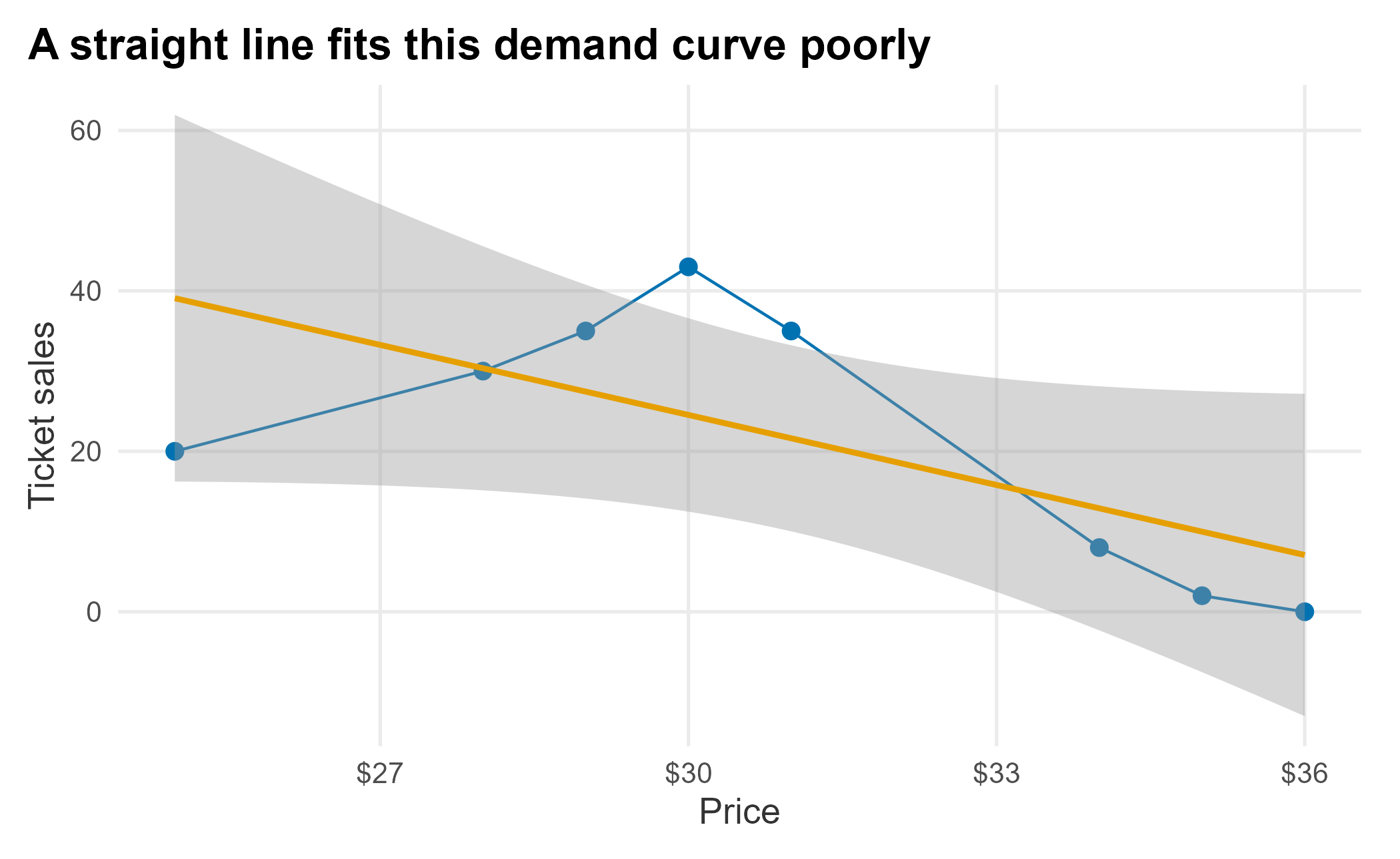
Figure 6.1: Linear price-response function
Demand generally falls as price rises, but the relationship need not be linear. The chart also hides a lot: we are pretending these are comparable single-game offers for one section, and ignoring when the tickets sold, through which channel, and what inventory was available. With that caveat, common price-response forms include:
Linear:
\[\begin{equation} d(p) = D - m \cdot p \end{equation}\]
Exponential:
\[\begin{equation} d(p) = C \cdot p^{\epsilon} \end{equation}\]
Logit:
\[\begin{equation} d(p) = \frac{C \cdot e^{a + b p}}{1 + e^{a + b p}} \end{equation}\]
The data does not look linear, exponential, or logit-shaped, so let’s try a simple second-degree polynomial.
ggplot(prf_data, aes(x = price, y = sales)) +
  geom_point(size = 2.5, color = plot_palette[1]) +
  geom_line(color = plot_palette[1]) +
  stat_smooth(method = "lm", formula = y ~ poly(x, 2),
              se = FALSE, color = plot_palette[2]) +
  scale_x_continuous(labels = scales::dollar) +
  labs(x = "Price", y = "Ticket sales",
       title = "A quadratic curve approximates demand much better") +
  book_theme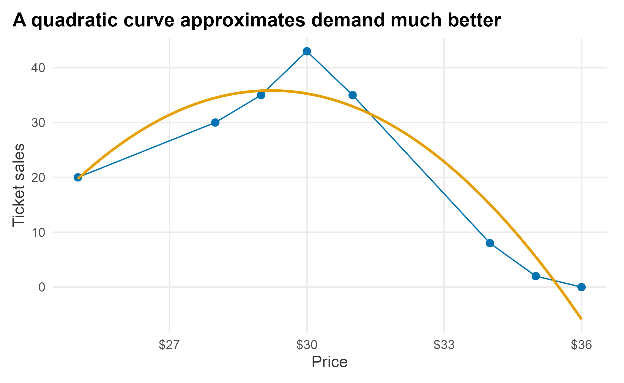
Figure 6.2: Polynomial price-response function
The curve fits well enough for a demonstration. We feed a polynomial to lm and build a small function that returns modeled sales for a price within the observed range. A polynomial can turn upward or predict negative demand outside that range, so it should not be extrapolated without bounds.
fit <- lm(sales ~ poly(price, 2, raw = TRUE), data = prf_data)

f_get_sales <- function(new_price) {
  b <- coef(fit)
  b[[1]] + b[[2]] * new_price + b[[3]] * new_price^2
}
This deliberately overfits eight points, which is acceptable only for the demonstration. The model is just a rearranged quadratic. A simple line takes the familiar form:
\[\begin{equation} y = m x + b \end{equation}\]
Adding a squared term gives us the curve:
\[\begin{equation} f(x) = b + m_1 x + m_2 x^2 \end{equation}\]
A useful way to think about regression is that each added term bends the line. Now we can apply the function to the original prices and compare.
old_prices <- prf_data$price
comparison <- tibble::tibble(
  price = old_prices,
  actual_sales = prf_data$sales,
  estimated_sales = f_get_sales(old_prices),
  difference = prf_data$sales - f_get_sales(old_prices)
)| price | actual_sales | estimated_sales | difference |
|---|---|---|---|
| 25 | 40 | 39.71 | 0.29 |
| 28 | 38 | 38.39 | -0.39 |
| 29 | 37 | 37.30 | -0.30 |
| 30 | 36 | 35.88 | 0.12 |
| 31 | 34 | 34.15 | -0.15 |
| 34 | 28 | 27.00 | 1.00 |
| 35 | 24 | 23.97 | 0.03 |
| 36 | 20 | 20.61 | -0.61 |
We can feed it any price. How many sales would we expect at $26?
f_get_sales(26)## [1] 39.59485The function also lets us find the top of the fitted curve, which is the price that maximizes the number of tickets sold. The fitted equation is:
\[\begin{equation} f(x) = -62.399 + 8.127\,x - 0.162\,x^2 \end{equation}\]
The maximum is where the derivative is zero. For a quadratic that is simply \(x = -m_1 / (2 m_2)\), so we never have to leave R.
co <- coef(fit)
optimal_price <- -co[[2]] / (2 * co[[3]])
optimal_sales <- f_get_sales(optimal_price)

c(optimal_price = optimal_price, optimal_sales = optimal_sales)
## optimal_price optimal_sales
## 25.13030 39.71716The fitted peak sits at about $25.13, where the model predicts roughly 39.7 tickets. That result makes economic sense: the lowest prices move the most tickets. If calculus is rusty, a math engine such as WolframAlpha 27 will take the derivative for you, and for whole-number prices over a small range you could just search the values directly.
ggplot(prf_data, aes(x = price, y = sales)) +
  geom_point(size = 2.5, color = plot_palette[1]) +
  geom_line(color = plot_palette[1]) +
  stat_smooth(method = "lm", formula = y ~ poly(x, 2),
              se = FALSE, color = plot_palette[2]) +
  geom_hline(yintercept = optimal_sales, linetype = 2, color = "grey50") +
  geom_vline(xintercept = optimal_price, linetype = 2, color = "grey50") +
  scale_x_continuous(labels = scales::dollar) +
  labs(x = "Price", y = "Ticket sales",
       title = "Lower prices move more tickets") +
  book_theme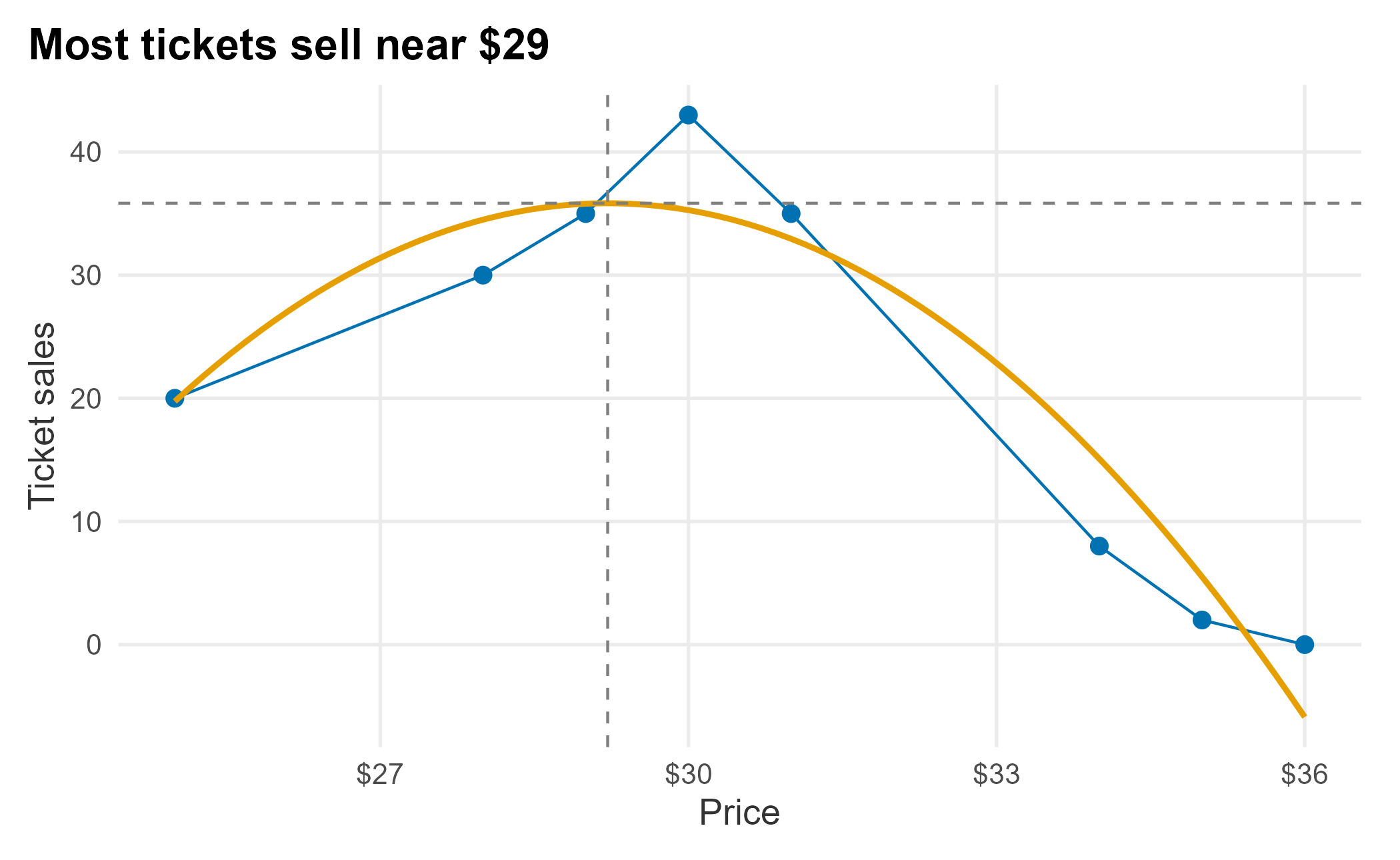
Figure 6.3: The attendance peak of the fitted curve
Selling the most tickets is not the same as making the most money. What does revenue look like across the price range?
estimated_prices <- 25:35
estimated_revenue <- tibble::tibble(
  price = estimated_prices,
  sales = f_get_sales(estimated_prices),
  revenue = f_get_sales(estimated_prices) * estimated_prices
)

revenue_optimum <- optimize(
  function(p) -(p * f_get_sales(p)),
  interval = range(estimated_prices)
)| price | sales | revenue |
|---|---|---|
| 25 | 39.7 | 992.9 |
| 26 | 39.6 | 1029.5 |
| 27 | 39.2 | 1057.1 |
| 28 | 38.4 | 1074.8 |
| 29 | 37.3 | 1081.6 |
| 30 | 35.9 | 1076.5 |
| 31 | 34.1 | 1058.5 |
| 32 | 32.1 | 1026.8 |
| 33 | 29.7 | 980.2 |
| 34 | 27.0 | 917.9 |
| 35 | 24.0 | 838.8 |
Each row is a separate pricing scenario, so the ticket quantities must not be added across rows. The $25 price sells the most tickets, but revenue peaks at a higher price because the additional dollars per ticket more than offset the lost volume. We can locate that revenue-maximizing price directly:
c(price = revenue_optimum$minimum,
  sales = f_get_sales(revenue_optimum$minimum),
  revenue = -revenue_optimum$objective)
## price sales revenue
## 29.08425 37.18926 1081.62159The model puts the revenue peak near $29, while attendance peaks near $25. That gap illustrates the basic trade-off between volume and revenue. Variable pricing goes further by allowing prices to differ across games, sections, and sales periods when their demand curves differ. The result still depends on our assumptions, and the picture changes the moment other constraints enter. If season-ticket holders already pay $29, a single-game price of $25 creates a brand problem. When inventory is limited, these choices also become more discrete.
6.3 Optimizing a full price structure
We found the peak of one section’s demand curve with a little calculus. A real venue has dozens of sections, each with its own curve, and they do not stand alone: raising the price behind home plate pushes some fans to the outfield, and you cannot let a bleacher seat cost more than a field-level one without confusing the market. You also cannot move any single price too far in one season without a brand or fairness problem. Set all of those prices at once, under all of those constraints, and there is no formula to solve by hand.
This is a constrained optimization problem: choose the prices that maximize revenue subject to rules you impose. R has good tooling for it. We will use nloptr (Ypma and Johnson 2025), an interface to the NLopt library, which can maximize a function you define while respecting bounds and constraints. The steps mirror a real pricing project: assemble the history, estimate a demand curve for each section, decide what the prices are and are not allowed to do, and let the optimizer search.
Start with the data. The FOSBAAS package ships a seating manifest with a single-game price for every seat, and secondary-market transactions we can trace back to a section. Aggregating gives one row per section: its price and the single-game tickets it sold.
library(nloptr)

man <- FOSBAAS::manifest_data
sec <- FOSBAAS::secondary_data

section_sales <- sec |>
  dplyr::left_join(dplyr::select(man, seatID, sectionNumber), by = "seatID") |>
  dplyr::filter(ticketType == "si", !is.na(sectionNumber)) |>
  dplyr::group_by(sectionNumber) |>
  dplyr::summarise(tickets = sum(tickets), .groups = "drop")

sections <- man |>
  dplyr::group_by(sectionNumber) |>
  dplyr::summarise(price = round(mean(singlePrice), 2),
                   seats = dplyr::n(), .groups = "drop") |>
  dplyr::left_join(section_sales, by = "sectionNumber") |>
dplyr::arrange(dplyr::desc(price))| sectionNumber | price | seats | tickets |
|---|---|---|---|
| 1 | 82.14 | 5305 | 37437 |
| 2 | 67.09 | 4427 | 29518 |
| 3 | 56.72 | 3689 | 27006 |
| 4 | 50.91 | 3247 | 19770 |
| 5 | 44.47 | 2741 | 15658 |
| 6 | 41.05 | 2472 | 17614 |
We have 29 sections spanning about $14 to $82. To fit a demand curve we need more than one point per section because we need to see how volume moved when price moved. In a real project that comes straight from your ticketing system’s history. The package does not ship two seasons at the section level, so we synthesize a plausible prior season: last year each section was priced a little lower, and the cheaper, more price-sensitive sections gave up proportionally more volume when prices rose. (With real history you would skip this step and use your own numbers.)
set.seed(715)
n <- nrow(sections)

# Cheaper sections are more price-sensitive; scale sensitivity to price rank.
sensitivity <- (max(sections$price) - sections$price) / diff(range(sections$price))
price_cut   <- runif(n, 0.03, 0.09)                       # last year was 3-9% cheaper
demand_gain <- (0.6 + 1.3 * sensitivity) * price_cut + rnorm(n, 0, 0.02)

sections <- sections |>
  dplyr::mutate(
    price_ly   = round(price / (1 + price_cut), 2),        # last year's price
    tickets_ly = round(tickets * (1 + demand_gain))        # last year's volume
  )
Two points define a line. We fit a linear demand curve \(q = a - b\,p\) through each section’s two seasons, which also gives us the section’s price elasticity at today’s price and the single-section revenue peak, which is the same vertex we found by hand earlier, now computed for all 29 at once.
sections <- sections |>
  dplyr::mutate(
    b      = -(tickets - tickets_ly) / (price - price_ly), # slope of demand
    a      = tickets + b * price,                          # intercept
    elast  = -b * price / tickets,                         # elasticity at current price
    vertex = a / (2 * b)                                   # single-section revenue peak
  )
The elasticities run from about -0.8 to -2.5, averaging near -1.8: most sections are elastic (a 1% price rise costs more than 1% of volume), but the premium seats are not. Elasticity is the whole story of what follows. Where demand is inelastic (elasticity between 0 and -1), raising the price raises revenue; where it is elastic, a discount can raise revenue by selling enough extra seats to more than make up for the lower price.
Now the rules. Two constraints tie the sections together, which is exactly why we cannot just set each one to its own vertex:
- Price-change bounds. No section’s price may move more than 20% from its current level in a single season. This guards against brand damage and sticker shock.
- A price ladder. Sections must stay ordered: a more expensive section can never end up priced below a cheaper one. Inverting the ladder cannibalizes your best inventory.
We write the objective (total revenue, negated because nloptr minimizes) and the ladder as an inequality constraint, then bound each price to its 20% band.
a <- sections$a; b <- sections$b
p0 <- sections$price

demand_at  <- function(p) a - b * p
f_objective <- function(p) -sum(p * demand_at(p))        # maximize revenue
f_ladder    <- function(p) diff(p) + 0.01                # prices must stay descending

lower <- p0 * 0.80
upper <- p0 * 1.20
nloptr needs a starting point (the current prices), the objective, the inequality constraints, and the bounds. We use COBYLA, a derivative-free algorithm that handles constraints well, making it a practical default when you do not want to hand it a gradient.
result <- nloptr(
  x0          = p0,
  eval_f      = f_objective,
  eval_g_ineq = f_ladder,
  lb          = lower,
  ub          = upper,
  opts = list(algorithm = "NLOPT_LN_COBYLA",
              xtol_rel = 1e-7, ftol_rel = 1e-9, maxeval = 20000)
)

opt_price  <- result$solution
opt_demand <- demand_at(opt_price)
revenue_summary <- tibble::tibble(
  current_revenue   = sum(p0 * sections$tickets),
  optimal_revenue   = sum(opt_price * opt_demand),
  revenue_lift      = optimal_revenue / current_revenue - 1,
  attendance_change = sum(opt_demand) / sum(sections$tickets) - 1
)| current_revenue | optimal_revenue | revenue_lift | attendance_change |
|---|---|---|---|
| $13,159,973 | $13,729,032 | 4.3% | 23.7% |
The optimizer lifts modeled revenue from about $13.2M to $13.7M, roughly 4%, and it does so mostly by filling seats: attendance rises about 24%. That volume figure is optimistic, because the model trusts a straight line all the way out to a 20% price cut; treat the direction as the lesson, not the exact magnitude. Here is the resulting price sheet.
price_plan <- sections |>
  dplyr::transmute(
    section    = sectionNumber,
    elasticity = round(elast, 2),
    current    = price,
    optimal    = round(opt_price, 2),
    change     = round(100 * (opt_price - price) / price, 1)
)| section | elasticity | current | optimal | change |
|---|---|---|---|---|
| 1 | -0.91 | 82.14 | 86.32 | 5.1 |
| 2 | -1.02 | 67.09 | 66.40 | -1.0 |
| 3 | -1.85 | 56.72 | 45.38 | -20.0 |
| 4 | -1.26 | 50.91 | 45.37 | -10.9 |
| 5 | -1.72 | 44.47 | 36.29 | -18.4 |
| 6 | -1.20 | 41.05 | 36.28 | -11.6 |
| 7 | -1.43 | 37.55 | 32.15 | -14.4 |
| 8 | -1.38 | 37.55 | 32.14 | -14.4 |
| 9 | -1.82 | 34.35 | 27.48 | -20.0 |
| 10 | -1.92 | 30.95 | 24.77 | -20.0 |
| 11 | -1.80 | 30.95 | 24.76 | -20.0 |
| 12 | -1.80 | 27.56 | 22.61 | -17.9 |
| 13 | -1.29 | 27.56 | 22.60 | -18.0 |
| 14 | -1.67 | 24.10 | 19.30 | -19.9 |
| 15 | -2.16 | 24.10 | 19.29 | -20.0 |
| 16 | -2.14 | 24.10 | 19.28 | -20.0 |
| 17 | -2.28 | 20.62 | 16.52 | -19.9 |
| 18 | -2.39 | 20.62 | 16.51 | -19.9 |
| 19 | -1.97 | 20.61 | 16.50 | -20.0 |
| 20 | -2.18 | 20.61 | 16.49 | -20.0 |
| 21 | -2.46 | 17.21 | 13.80 | -19.8 |
| 22 | -1.24 | 17.21 | 13.79 | -19.9 |
| 23 | -2.25 | 17.21 | 13.78 | -19.9 |
| 24 | -1.94 | 17.21 | 13.77 | -20.0 |
| 25 | -2.22 | 13.80 | 11.08 | -19.7 |
| 26 | -1.65 | 13.80 | 11.07 | -19.8 |
| 27 | -1.92 | 13.80 | 11.06 | -19.9 |
| 28 | -0.83 | 13.80 | 11.05 | -19.9 |
| 29 | -2.43 | 13.80 | 11.04 | -20.0 |
The pattern is textbook. The two premium lower-bowl sections are inelastic, so the optimizer nudges the most expensive one up about 5% and holds the near-unit-elastic one roughly flat. Every elastic section is discounted, most of them all the way to the 20%-cut floor. Plotting the recommended change against elasticity makes the rule visible, with the theoretical break-even at an elasticity of -1.
ggplot(price_plan, aes(x = elasticity, y = change)) +
  geom_hline(yintercept = 0, color = "grey70") +
  geom_vline(xintercept = -1, linetype = 2, color = "grey55") +
  geom_point(size = 2.6, color = plot_palette[1]) +
  labs(x = "Estimated price elasticity", y = "Recommended price change (%)",
       title = "Raise inelastic sections, discount elastic ones") +
  book_theme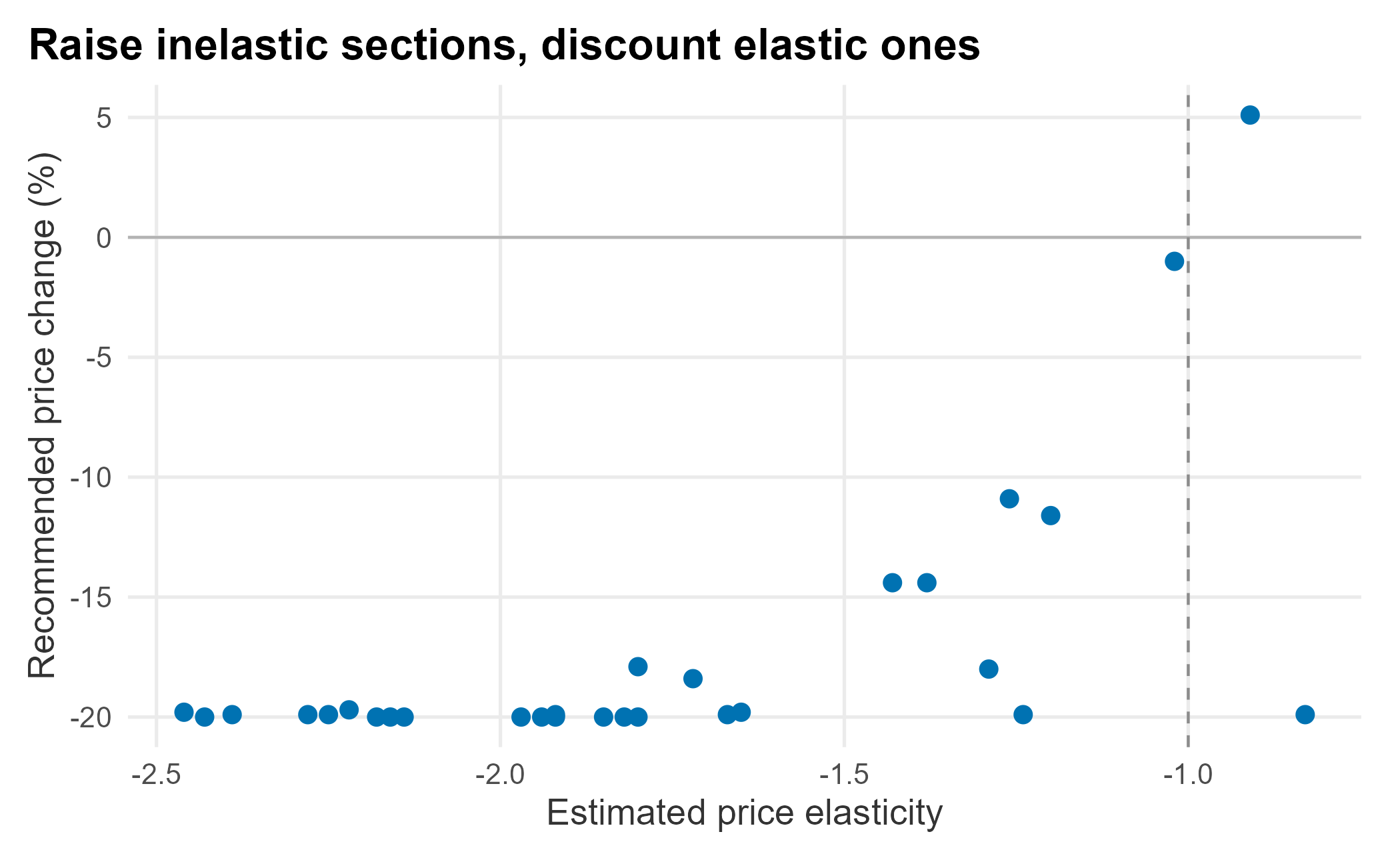
Figure 6.4: Recommended price change against elasticity
A handful of sections do not sit exactly where their own elasticity would put them. That is the ladder doing its job. An inelastic section stranded at the bottom of the price structure gets pulled down with its neighbors rather than being allowed to leapfrog them. That is the whole point of optimizing every price together instead of one at a time. The last check is that the ladder held: cheaper sections should never overtake expensive ones.
ladder <- price_plan |>
  dplyr::select(section, Current = current, Optimal = optimal) |>
  tidyr::pivot_longer(-section, names_to = "plan", values_to = "price")

ggplot(ladder, aes(x = reorder(factor(section), price), y = price,
                   color = plan, group = plan)) +
  geom_line() +
  geom_point(size = 2) +
  scale_color_manual("", values = plot_palette) +
  scale_y_continuous(labels = scales::dollar) +
  labs(x = "Section (cheapest to most expensive)", y = "Single-game price",
       title = "The optimizer keeps the price ladder intact") +
  book_theme
Figure 6.5: Current and optimized price ladder
This is a scaffold, not a finished pricing engine, and it is worth being clear about the shortcuts. A demand line fit through two seasons is crude. Elasticity from two points is a rough estimate, and the honest fix is more history. We modeled cannibalization with a simple ordering rule; the fuller treatment is a cross-price elasticity matrix that says exactly how much demand shifts from each section to every other when a price moves, which needs far more data to estimate well. And we optimized revenue alone. You could just as easily maximize contribution by subtracting seat-level costs, hold total attendance above a floor so you do not gut the gate, or add a constraint that season-ticket value stays protected. The machinery does not change: you add terms to the objective and rows to the constraint list, and nloptr searches the same way. That flexibility is why optimization belongs in a pricing toolkit alongside the price-response functions we started with.
6.4 Basics of forecasting
Forecasting underpins pricing, and it can get very sophisticated. We will stay practical and focus on how to think about it. The FOSBAAS package can build seasons of simulated schedule-and-sales data with f_build_season; the seeds and arguments let you create different conditions. We will build three past seasons.
season_2022 <- FOSBAAS::f_build_season(
  seed1 = 3000, season_year = 2022, seed2 = 714, num_games = 81,
  seed3 = 366, num_bbh = 5, num_con = 3, num_oth = 5,
  seed4 = 309, seed5 = 25, mean_sales = 29000, sd_sales = 3500)

season_2023 <- FOSBAAS::f_build_season(
  seed1 = 755, season_year = 2023, seed2 = 4256, num_games = 81,
  seed3 = 54, num_bbh = 6, num_con = 4, num_oth = 7,
  seed4 = 309, seed5 = 25, mean_sales = 30500, sd_sales = 3000)

season_2024 <- FOSBAAS::f_build_season(
  seed1 = 2892, season_year = 2024, seed2 = 714, num_games = 81,
  seed3 = 366, num_bbh = 9, num_con = 2, num_oth = 6,
  seed4 = 6856, seed5 = 2892, mean_sales = 32300, sd_sales = 2900)

past_season <- rbind(season_2022, season_2023, season_2024)| gameNumber | team | date | dayOfWeek | month | weekEnd | |
|---|---|---|---|---|---|---|
| 238 | 76 | FLA | 2024-09-22 | Sun | Sep | FALSE |
| 239 | 77 | FLA | 2024-09-23 | Mon | Sep | FALSE |
| 240 | 78 | FLA | 2024-09-24 | Tue | Sep | FALSE |
| 241 | 79 | LAA | 2024-10-04 | Fri | Oct | TRUE |
| 242 | 80 | LAA | 2024-10-05 | Sat | Oct | TRUE |
| 243 | 81 | LAA | 2024-10-06 | Sun | Oct | FALSE |
This section goes a little deeper into regression. If you want to do this for real, buy a book on it. A practical favorite is An R Companion to Applied Regression by Fox and Weisberg (John Fox 2019). You will need to be comfortable with terms like hypothesis testing, normality, independence, linearity, validation, homoskedasticity, autocorrelation, multicollinearity, interaction terms, and transformations. Sports data often contains skewed outcomes, repeated observations, time dependence, and grouped effects, so textbook assumptions are not always met. We will cover the essential diagnostics, but you should know how deep the water gets.
There are two broad approaches:
- Top-down forecasts use macro factors such as team payroll and projected wins. They are useful for comparing potential across a whole league.
- Bottom-up forecasts use specific inputs such as the marketing schedule and game attractiveness in your market, including rivalry games.
We will build a bottom-up forecast. First, split the data into training and test sets so we can evaluate the model on observations it did not learn from. This random 5% holdout keeps the demonstration compact. For a production forecast, use a larger holdout from a later period so the test better matches the task of forecasting future games.
set.seed(715)
test_rows <- sample(seq_len(nrow(past_season)),
                    size = round(0.05 * nrow(past_season)))
train <- past_season[-test_rows, ]
test  <- past_season[test_rows, ]
Now fit a simple linear model on the training data. Why these variables? Variable selection can be involved, and the goal is a parsimonious model: the simplest one that captures the signal needed for the decision. For now we pick a few reasonable predictors. Remember that this is mixed data; most regression tutorials use clean, normally distributed numbers, which you rarely get in the wild.
ln_mod_bu <- lm(
  ticketSales ~ promotion + daysSinceLastGame + schoolInOut + weekEnd + team,
  data = train
)
The full summary looks like this:
##
## Call:
## lm(formula = ticketSales ~ promotion + daysSinceLastGame + schoolInOut +
##     weekEnd + team, data = train)
##
## Residuals:
##      Min       1Q   Median       3Q      Max
## -12147.0  -2555.2    111.6   2409.9   8090.0
##
## Coefficients:
##                   Estimate Std. Error t value Pr(>|t|)
## (Intercept)       32146.89    2981.05  10.784  < 2e-16 ***
## promotionconcert  -1918.16    1690.76  -1.134 0.257931
## promotionnone     -4144.44    1007.42  -4.114 5.66e-05 ***
## promotionother    -3280.15    1394.65  -2.352 0.019637 *
## daysSinceLastGame   285.05      44.06   6.470 7.25e-10 ***
## schoolInOutTRUE    4377.39    1043.31   4.196 4.07e-05 ***
## weekEndTRUE        6869.37     617.40  11.126  < 2e-16 ***
## teamATL            3736.08    3048.48   1.226 0.221793
## teamBAL            3753.91    2963.19   1.267 0.206669
## teamBOS           11659.75    3691.12   3.159 0.001827 **
## teamCHC           12523.38    3627.72   3.452 0.000677 ***
## teamCIN            3930.39    3281.87   1.198 0.232473
## teamCLE            2251.84    2962.52   0.760 0.448076
## teamCOL            3711.93    3322.88   1.117 0.265286
## teamCWS            4451.79    3037.94   1.465 0.144367
## teamDET            3246.65    3323.77   0.977 0.329838
## teamFLA            3081.54    2976.28   1.035 0.301735
## teamHOU            9720.20    3026.20   3.212 0.001534 **
## teamKAN            5048.86    3796.86   1.330 0.185101
## teamLAA            8598.82    2935.38   2.929 0.003787 **
## teamLAD           12190.43    3255.50   3.745 0.000236 ***
## teamMIN            2207.90    3791.97   0.582 0.561043
## teamNYM            9010.54    3085.41   2.920 0.003893 **
## teamOAK            3794.65    3777.43   1.005 0.316311
## teamPHI            8987.97    4018.36   2.237 0.026398 *
## teamSF             9303.22    3810.98   2.441 0.015501 *
## teamTB             3465.27    3223.73   1.075 0.283689
## teamTEX            4852.09    3125.30   1.553 0.122103
## teamWAS            1987.36    3105.09   0.640 0.522876
## ---
## Signif. codes:  0 '***' 0.001 '**' 0.01 '*' 0.05 '.' 0.1 ' ' 1
##
## Residual standard error: 3968 on 202 degrees of freedom
## Multiple R-squared:  0.6298, Adjusted R-squared:  0.5785
## F-statistic: 12.27 on 28 and 202 DF,  p-value: < 2.2e-16
A quick guide to that output:
- Estimate: the coefficients in the fitted equation.
- Std. Error: the estimated uncertainty of each coefficient.
- t value: the estimate divided by its standard error.
- Pr(>|t|): the p-value for testing whether a coefficient is zero, conditional on the model assumptions.
- Residual standard error: the typical residual size, measured in tickets.
- Multiple R-squared: the share of in-sample variance the model explains.
- F-statistic: a test of whether the predictors, taken together, improve on an intercept-only model.
This model explains about 63% of the in-sample variance in ticket sales. Whether that is useful depends on its holdout error and the decision it supports, not on R-squared alone. We will pull a few key statistics into a tidy table so we can compare models as we go.
model_stats <- function(model) {
  s <- summary(model)
  tibble::tibble(
    residual_se = s$sigma,
    r_squared = s$r.squared,
    adj_r_squared = s$adj.r.squared,
    f_stat = s$fstatistic[[1]]
  )
}| residual_se | r_squared | adj_r_squared | f_stat |
|---|---|---|---|
| 3967.573 | 0.63 | 0.578 | 12.274 |
OLS regression makes assumptions about the underlying data, and when they are violated the model can mislead you. The car package (Fox et al. 2024) has good tools for checking them. We will look at a few.
6.4.1 Outliers and unusual points
Regression is sensitive to extreme points, such as a rainout or a runaway promotion. Sometimes it is right to remove them, but only when the data or business context justifies the exclusion.
library(car)
car::outlierTest(ln_mod_bu)
## No Studentized residuals with Bonferroni p < 0.05
## Largest |rstudent|:
## rstudent unadjusted p-value Bonferroni p
## 48 -3.215013 0.0015199 0.35109The test reports the single most extreme observation, but its Bonferroni-adjusted p-value is well above 0.05, so it is not actually a significant outlier. That is a useful reminder: “most extreme” is not the same as “problematic.” A Q-Q plot checks the normality assumption against a 95% confidence envelope.
qq <- car::qqPlot(ln_mod_bu, main = "")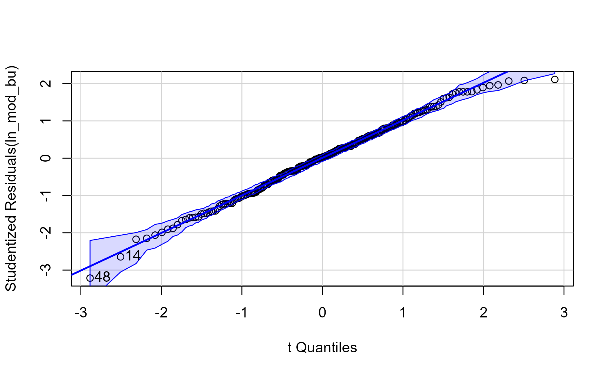
Figure 6.6: Q-Q plot of the model residuals
Most points fall along the line, with a few strays. An influence plot combines several diagnostics: the bigger the bubble, the larger the Cook’s distance, a measure of how much a single point pulls the model.
influential <- car::influencePlot(ln_mod_bu)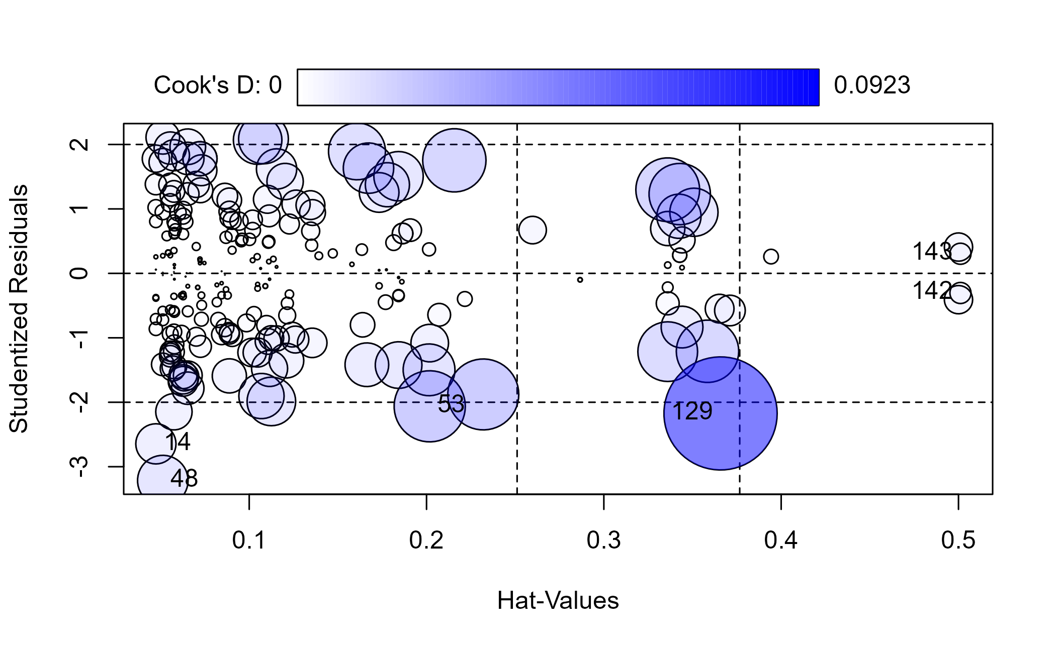
Figure 6.7: Influence plot for the model
| StudRes | Hat | CookD | |
|---|---|---|---|
| 14 | -2.645 | 0.047 | 0.012 |
| 48 | -3.215 | 0.051 | 0.018 |
| 53 | -2.063 | 0.202 | 0.037 |
| 129 | -2.174 | 0.366 | 0.092 |
| 142 | -0.304 | 0.501 | 0.003 |
| 143 | 0.304 | 0.501 | 0.003 |
Several points carry outsized influence. An influence flag is a prompt to investigate, not an automatic reason to delete a row. If an unmodeled outside factor such as weather explains a point, exclusion may be defensible. Here we refit without the flagged rows only as a sensitivity analysis, using the returned row labels rather than hand-picking observations.
train_clean <- train[!rownames(train) %in% rownames(influential), ]

ln_mod_clean <- lm(
  ticketSales ~ promotion + daysSinceLastGame + schoolInOut + weekEnd + team,
  data = train_clean
)| residual_se | r_squared | adj_r_squared | f_stat |
|---|---|---|---|
| 3756.14 | 0.648 | 0.6 | 13.451 |
Removing them gives only a modest improvement in the in-sample summary. That does not prove the exclusions are valid or improve forecasting accuracy.
6.4.2 Checking the model’s assumptions
OLS leans on a handful of assumptions, and the Q-Q plot only speaks to one of them. Before we trust a model, let alone price against it, it is worth running the formal tests for the rest. Each one targets a specific assumption from the list above, and car provides most of them. None of these tests fix anything; they tell you where the model is on solid ground and where to be skeptical.
Start with multicollinearity: when predictors are strongly correlated with one another, the coefficients become unstable and hard to interpret. The variance inflation factor (VIF) quantifies it. Because some of our predictors are factors, car reports the generalized VIF; the last column, GVIF^(1/(2*Df)), is the one to read, and squaring it puts it on the familiar VIF scale.
car::vif(ln_mod_clean)## GVIF Df GVIF^(1/(2*Df))
## promotion 1.490686 3 1.068803
## daysSinceLastGame 1.090933 1 1.044477
## schoolInOut 3.676328 1 1.917375
## weekEnd 1.075422 1 1.037025
## team 5.763119 21 1.042584Every value sits close to 1, well under the usual rule-of-thumb threshold of about 2 on that adjusted scale (a VIF of 5 to 10). Our predictors are not stepping on each other, so we can read the coefficients at face value.
Next, independence of the residuals. OLS assumes each observation’s error is unrelated to the next; with data stacked in schedule order that is worth checking, since consecutive games and homestands can move together. The Durbin-Watson test looks for that autocorrelation.
set.seed(715)
car::durbinWatsonTest(ln_mod_clean)
## lag Autocorrelation D-W Statistic p-value
## 1 0.1100961 1.77839 0.006
## Alternative hypothesis: rho != 0The statistic sits near 1.78; a value of 2 would indicate no first-order autocorrelation. The estimated positive autocorrelation is around 0.11, and the test flags it as statistically detectable. It is mild, but it is a reminder that games in sequence are not fully independent, and that a time-aware model could do better.
Now consider homoscedasticity, the assumption that the residuals have constant variance across the range of the fitted values. If the spread fans out, conventional standard errors and the p-values that depend on them can be misleading. The Breusch-Pagan test, ncvTest in car, checks it.
car::ncvTest(ln_mod_clean)## Non-constant Variance Score Test
## Variance formula: ~ fitted.values
## Chisquare = 8.472842, Df = 1, p = 0.0036049Here the p-value is well below 0.05, so we reject constant variance: the model has heteroscedasticity. That is a genuine flaw, and exactly the kind of thing a transform of the response can sometimes reduce. We try that next.
Two more, quickly. The Q-Q plot suggested the residuals were roughly normal; the Shapiro-Wilk test puts a number on it.
shapiro.test(residuals(ln_mod_clean))##
## Shapiro-Wilk normality test
##
## data: residuals(ln_mod_clean)
## W = 0.98967, p-value = 0.1077The p-value is comfortably above 0.05, so we do not reject normality. This is not proof of normality, but it is consistent with what the Q-Q plot shows. Finally, a component-plus-residual plot checks linearity for our one continuous predictor: if the pink line tracks the dashed blue one, a straight-line term is appropriate.
car::crPlots(ln_mod_clean, terms = ~ daysSinceLastGame)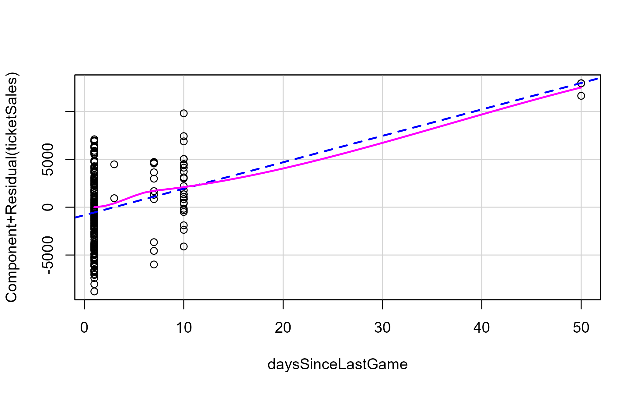
Figure 6.8: Component-plus-residual plot for days since last game
So this model passes on multicollinearity, normality, and linearity, but fails on constant variance and shows mild autocorrelation. That is a common result with sports data because the textbook assumptions are rarely all met at once. The point of running the tests is not to reach a perfect model; it is to know precisely where yours is weak so you can decide whether the weakness matters for the decision at hand.
The heteroscedasticity is the flaw most worth chasing. We can look for interaction terms or transform the response; powerTransform suggests a power to apply.
summary(car::powerTransform(ln_mod_clean))## bcPower Transformation to Normality
## Est Power Rounded Pwr Wald Lwr Bnd Wald Upr Bnd
## Y1 2.8177 2.82 2.0202 3.6152
##
## Likelihood ratio test that transformation parameter is equal to 0
## (log transformation)
## LRT df pval
## LR test, lambda = (0) 56.93105 1 4.5186e-14
##
## Likelihood ratio test that no transformation is needed
## LRT df pval
## LR test, lambda = (1) 22.39875 1 2.2152e-06The suggested power is nowhere near zero, so a log transform is unlikely to stabilize the variance. We will still fit one to illustrate the comparison.
ln_mod_log <- lm(
  log(ticketSales) ~ promotion + daysSinceLastGame + schoolInOut + weekEnd + team,
  data = train_clean
)| residual_se | r_squared | adj_r_squared | f_stat |
|---|---|---|---|
| 0.108 | 0.627 | 0.576 | 12.263 |
The table is on the log scale, so its residual standard error and R-squared should not be compared directly with those from the untransformed model. A fair comparison would back-transform the predictions, account for retransformation bias, and evaluate both models on the same holdout metric. The required accuracy should match the financial decision and its downside risk.
Now apply the model to the test set. There is one wrinkle: a holdout game can feature an opponent that never appears in the training data, and a linear model cannot score a factor level it has never seen. We drop those games before predicting. This is a small preview of a problem we hit again below.
test_scored <- test |>
  dplyr::filter(team %in% unique(train_clean$team))

test_scored <- test_scored |>
  mutate(
    pred_tickets = predict(ln_mod_clean, newdata = test_scored),
    perc_diff = (ticketSales - pred_tickets) / ticketSales
)| mean_signed_error | mean_absolute_error |
|---|---|
| -0.036 | 0.152 |
On average the model is only a few percent off, but the signed average hides the spread: the mean absolute error is much larger, so individual games can miss badly even when the average looks fine. The plot makes that clear.
forecast_long <- test_scored |>
  mutate(game = row_number()) |>
  tidyr::pivot_longer(
    cols = c(ticketSales, pred_tickets),
    names_to = "series", values_to = "value"
  ) |>
  mutate(series = dplyr::recode(series,
                         ticketSales = "Actual",
                         pred_tickets = "Predicted"))

ggplot(forecast_long, aes(x = game, y = value, color = series)) +
  geom_point(size = 2.5) +
  geom_line() +
  scale_color_manual("", values = plot_palette) +
  scale_y_continuous(labels = scales::comma) +
  labs(x = "Selected game", y = "Ticket sales",
       title = "Average error is low, but individual games vary") +
  book_theme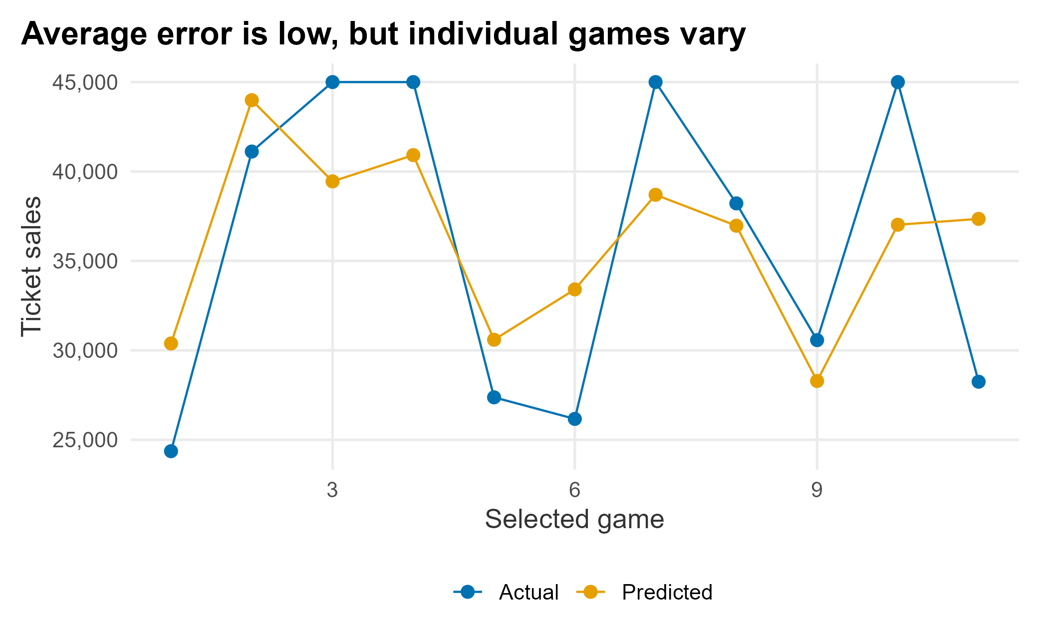
Figure 6.9: Forecast versus actual on the test set
Would I use this model on new data? Yes, while looking for predictors that improve it. The further from the season you forecast, the blunter the estimates: you may not have a promotional schedule, and dropping insignificant teams means you cannot use them to predict at all. You often settle for “good enough.”
6.4.3 A mixed-effects alternative
That last problem, having to throw away a holdout game because its opponent never appeared in training, is worth dwelling on. Our OLS model treats team as a fixed factor, so it estimates a separate, independent coefficient for each of the 22 opponents in the training data and knows nothing about a 23rd. Two things go wrong. Opponents that visit only once or twice get noisy estimates built from a handful of games, and a brand-new opponent cannot be scored at all.
A mixed-effects (or multilevel) model handles this differently. Instead of an unrelated coefficient per team, it treats the per-team intercepts as draws from a shared distribution and estimates that distribution’s variance. Teams with little data are pulled toward the league average, an effect called partial pooling or shrinkage, and a never-before-seen opponent simply inherits the average. We keep the same predictors as fixed effects and add a random intercept for team, written (1 | team). The lme4 package (Bates et al. 2025) fits it.
library(lme4)
me_mod <- lmer(
  ticketSales ~ promotion + daysSinceLastGame + schoolInOut + weekEnd + (1 | team),
  data = train_clean
)
summary(me_mod)
## Linear mixed model fit by REML ['lmerMod']
## Formula: ticketSales ~ promotion + daysSinceLastGame + schoolInOut + weekEnd + (1 | team)
## Data: train_clean
##
## REML criterion at convergence: 4274
##
## Scaled residuals:
## Min 1Q Median 3Q Max
## -2.25992 -0.67631 0.01302 0.65478 2.15649
##
## Random effects:
## Groups Name Variance Std.Dev.
## team (Intercept) 8807170 2968
## Residual 14164484 3764
## Number of obs: 225, groups: team, 22
##
## Fixed effects:
## Estimate Std. Error t value
## (Intercept) 38342.78 1158.69 33.091
## promotionconcert -1679.89 1584.67 -1.060
## promotionnone -4300.24 941.20 -4.569
## promotionother -3059.88 1325.52 -2.308
## daysSinceLastGame 268.19 41.72 6.429
## schoolInOutTRUE 3752.17 862.41 4.351
## weekEndTRUE 6709.25 583.82 11.492
##
## Correlation of Fixed Effects:
## (Intr) prmtnc prmtnn prmtnt dysSLG sIOTRU
## promtncncrt -0.404
## promotionnn -0.710 0.527
## promotinthr -0.505 0.346 0.627
## dysSncLstGm -0.092 -0.147 -0.013 0.055
## schlInOTRUE -0.253 -0.027 -0.056 0.000 0.012
## weekEndTRUE -0.122 -0.018 -0.046 0.008 0.047 0.044Read the summary in two parts. The fixed effects look like an ordinary regression: a weekend lifts sales by about 6,700 tickets, each additional day of rest by roughly 270, and school being in session by about 3,800. These are the population-level averages, holding the opponent aside. The random effects are the new part. The between-team standard deviation is about 2,968 tickets and the residual standard deviation about 3,764 tickets. Comparing their variances tells us how much of the leftover variation is between opponents rather than game-to-game noise:
vc <- as.data.frame(lme4::VarCorr(me_mod))
team_var  <- vc$vcov[vc$grp == "team"]
resid_var <- vc$vcov[vc$grp == "Residual"]
icc <- team_var / (team_var + resid_var)
icc
## [1] 0.3833929About 38% of the unexplained variation lives at the team level, as measured by the intraclass correlation. That is a lot: who you play matters, and a model that ignores it is leaving structure on the table. We can look at each team’s estimated intercept (its deviation from the average game) with a caterpillar plot, sorted from the smallest draw to the largest. The bars are approximate 95% intervals.
re     <- ranef(me_mod, condVar = TRUE)$team
re_se  <- sqrt(attr(re, "postVar")[1, 1, ])

team_effects <- tibble::tibble(
  team   = rownames(re),
  effect = re[["(Intercept)"]],
  se     = re_se
) |>
  mutate(team = forcats::fct_reorder(team, effect))

ggplot(team_effects, aes(x = effect, y = team)) +
  geom_vline(xintercept = 0, linetype = "dashed", color = "grey50") +
  geom_pointrange(aes(xmin = effect - 2 * se, xmax = effect + 2 * se),
                  color = plot_palette[1]) +
  scale_x_continuous(labels = scales::comma) +
  labs(x = "Estimated effect on ticket sales", y = "Opponent",
       title = "Some opponents reliably lift the gate") +
  book_theme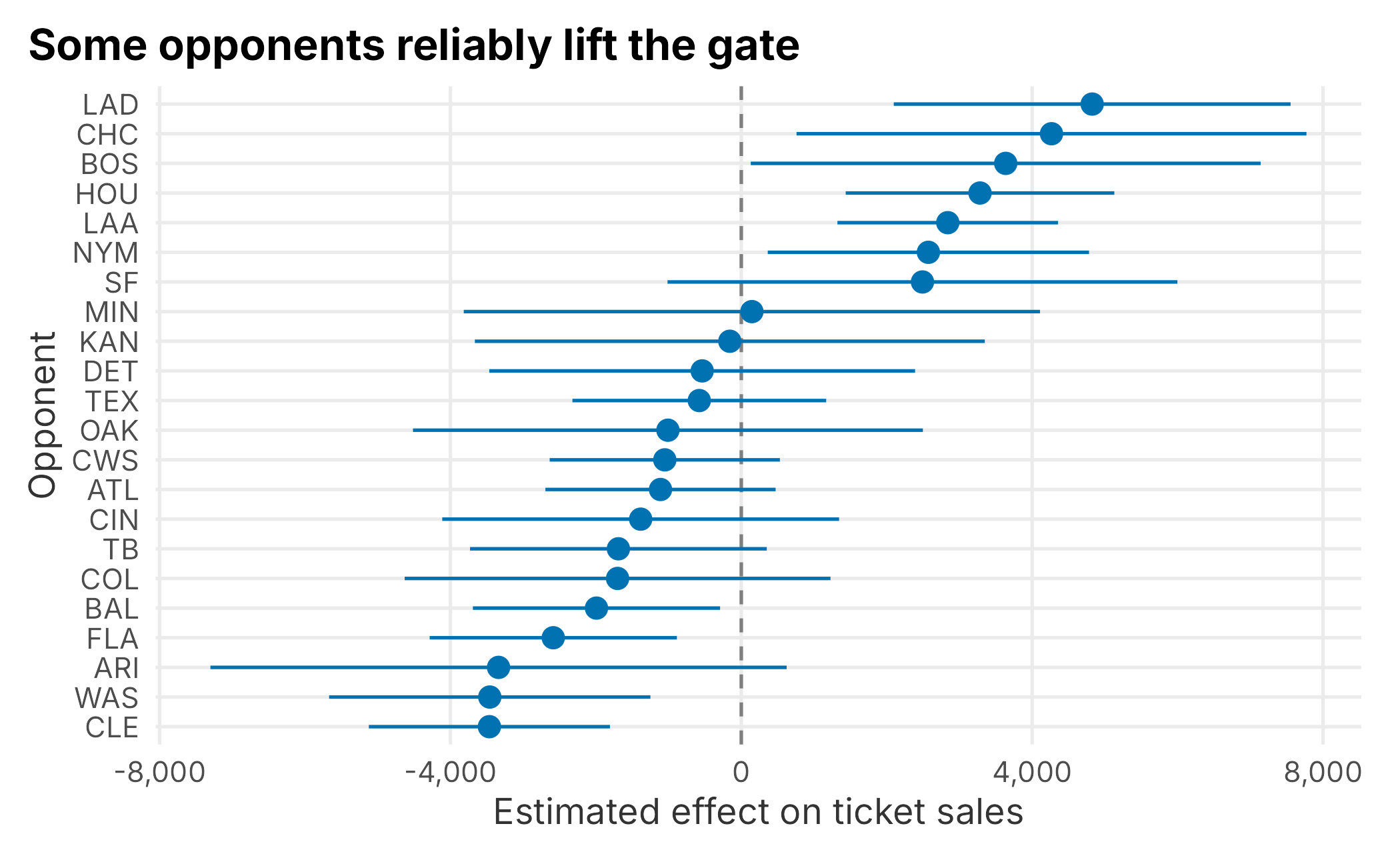
Figure 6.10: Estimated team effects with approximate 95% intervals
The best-drawing opponent is associated with roughly 4,800 more tickets than the average game, the weakest about 3,500 below it. That is a material difference, and exactly the kind of signal you want feeding a schedule-based forecast. Now the payoff. When we scored the OLS model we had to drop the holdout game whose opponent never appeared in training. The mixed model does not: with allow.new.levels = TRUE, an unseen opponent falls back to the population average instead of erroring out.
test_me <- test |>
  mutate(
    pred_tickets = predict(me_mod, newdata = test, allow.new.levels = TRUE),
    perc_diff = (ticketSales - pred_tickets) / ticketSales
)| games_scored | mean_signed_error | mean_absolute_error |
|---|---|---|
| 12 | -0.036 | 0.14 |
The mixed model scores every holdout game, including the one the OLS model could not touch, with accuracy as good as or slightly better than before. That is the practical case for reaching for lmer with sports data: it is built for exactly the grouped, unbalanced, new-levels-keep-appearing structure a schedule throws at you.
You can keep adding structure. Games are also grouped by day of week, so we could add a second, crossed random intercept, (1 | dayOfWeek); here it barely moves the needle because weekEnd already captures most of that signal. This is a useful reminder that more random effects are not automatically better. You can also let a slope vary by group, for instance by allowing the rest-day effect to differ by team with (1 + daysSinceLastGame | team), though with only a few dozen games per season those richer models are easy to overfit. As always, start simple and add complexity only when the data supports it.
6.4.4 Analyzing a schedule and ranking games
How much does the schedule drive a team’s financial success? For baseball, ticket sales are the main revenue stream and most others derive from it. I like an ensemble approach that answers the same question two ways. Here we score games by how attractive they look to fans, using secondary-market purchases as a demand signal.
sm  <- FOSBAAS::secondary_data
man <- FOSBAAS::manifest_data
sea <- FOSBAAS::season_data
sea$gameID <- seq_len(nrow(sea))
We join secondary sales to the manifest (which carries the seat’s single-game price) and summarize by game.
avg_price_comps <- sm |>
  dplyr::left_join(man, by = "seatID") |>
  dplyr::select(gameID, price, singlePrice, tickets) |>
  na.omit() |>
  dplyr::group_by(gameID) |>
  dplyr::summarise(
    mean_secondary = mean(price),
    mean_primary = mean(singlePrice),
    tickets = sum(tickets),
    .groups = "drop"
)| gameID | mean_secondary | mean_primary | tickets |
|---|---|---|---|
| 1 | 40.36 | 44.20 | 3101 |
| 2 | 40.73 | 44.17 | 3520 |
| 3 | 39.97 | 43.85 | 3186 |
| 4 | 40.02 | 43.44 | 3484 |
| 5 | 39.83 | 43.49 | 3293 |
| 6 | 41.43 | 45.21 | 3347 |
This data was not built to be linked, so we nudge it to look realistic: we add a scaled version of ticket sales to the mean secondary price, creating a relationship a model can pick up.
sea_adj <- sea |> dplyr::left_join(avg_price_comps, by = "gameID")
sea_adj$mean_secondary_adj <-
  sea_adj$mean_secondary + as.vector(scale(sea_adj$ticketSales)) * 10
Now we model the adjusted secondary price.
ln_mod_sec <- lm(
  mean_secondary_adj ~ promotion + daysSinceLastGame + schoolInOut + weekEnd + team,
  data = sea_adj
)| residual_se | r_squared | adj_r_squared | f_stat |
|---|---|---|---|
| 3.071 | 0.919 | 0.908 | 77.598 |
This model explains about 92% of the variance in secondary prices. The high fit is partly a consequence of the relationship we injected. Treat this as a workflow demonstration, not evidence that the model will generalize.
6.4.5 Applying the models to a new season
With two models in hand, one for primary ticket sales and one for secondary prices, we can score a brand-new schedule. We build a 2025 season with no sales baked in, then predict.
season_2025 <- FOSBAAS::f_build_season(
  seed1 = 755, season_year = 2025, seed2 = 714, num_games = 81,
  seed3 = 366, num_bbh = 5, num_con = 3, num_oth = 7,
  seed4 = 366, seed5 = 1, mean_sales = 0, sd_sales = 0)
seed2 = 714 controls which opponents appear in the schedule. Change it and you may get teams the models never saw, which they cannot score. This is the same factor-level problem we hit on the test set. Here we reuse 714, so every opponent is familiar.
season_2025$pred_tickets <- predict(ln_mod_clean, newdata = season_2025)
season_2025$pred_prices  <- predict(ln_mod_sec, newdata = season_2025)
Now we turn the two predictions into a single event score by standardizing each and adding them. Standardizing puts both on the same scale before we combine them. The score is relative to this schedule, and the equal weighting is a judgment call rather than an estimated economic value.
season_2025 <- season_2025 |>
  mutate(
    score_tickets = as.vector(scale(pred_tickets)) * 100,
    score_prices  = as.vector(scale(pred_prices)) * 100,
    eventScore = score_tickets + score_prices
  ) |>
  arrange(desc(eventScore)) |>
  mutate(rank = row_number())
ggplot(season_2025, aes(x = rank, y = eventScore)) +
  geom_line(color = "grey60") +
  geom_point(size = 1.4, color = plot_palette[1]) +
  scale_y_continuous(labels = scales::comma) +
  labs(x = "Game (ranked)", y = "Event score",
       title = "Games fall into bands of attractiveness") +
  book_theme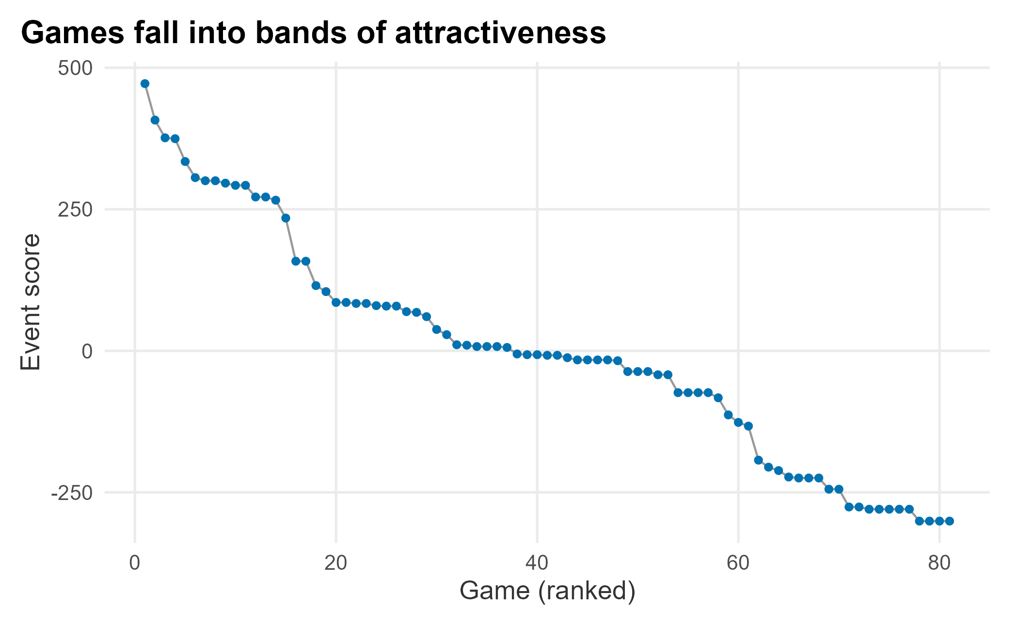
Figure 6.11: Ordered event scores for the 2025 schedule
The curve shows bands of similarly attractive games. We can price progressively so the highest-demand games carry higher prices. To make the bands explicit, cluster the games on their event score with k-means, a simple, widely used method for grouping numeric data.
set.seed(715)
clusters <- kmeans(season_2025$eventScore, centers = 6)
season_2025$cluster <- clusters$cluster
cluster_summary <- season_2025 |>
  group_by(cluster) |>
  summarise(
    mean_score = mean(eventScore),
    median_score = median(eventScore),
    sd_score = sd(eventScore),
    games = n(),
    .groups = "drop"
  ) |>
arrange(desc(mean_score))| cluster | mean_score | median_score | sd_score | games |
|---|---|---|---|---|
| 1 | 319.7 | 300.4 | 62.7 | 15 |
| 3 | 93.6 | 83.7 | 30.7 | 14 |
| 5 | -8.6 | -7.9 | 21.0 | 24 |
| 4 | -93.8 | -78.4 | 25.9 | 8 |
| 2 | -221.7 | -224.6 | 16.7 | 9 |
| 6 | -286.7 | -279.7 | 11.2 | 11 |
We now have several tiers of games. We can use them to set reference prices, or to find games that need marketing help, which we pick up in Chapter 8. Attractiveness is a proxy for demand, not a full pricing system: reference pricing, inventory, and season-ticket prices all matter. To improve this bottom-up forecast we would layer on the number of season tickets sold and expected, available inventory by game and how it is allocated, and prices and volume by ticket class. Conditions are never perfect, and a single model is rarely powerful enough. That is why an ensemble that also uses a liquid secondary market is worth the effort.
6.5 Leveraging qualitative data
Surveys can support pricing. Two methods we have used in practice are the Van Westendorp price sensitivity meter and conjoint analysis. Both are supported by survey tools such as Qualtrics. Conjoint is complex and beyond our scope; let’s look at Van Westendorp, which is approachable and useful.
First, some survey data. A Van Westendorp study asks four questions about a product, in this case dugout seats, and asks at what price it becomes too cheap, cheap, expensive, and too expensive.
set.seed(715)
too_cheap <- round(rnorm(1000, 50, 10))
cheap <- too_cheap + round(abs(rnorm(1000, 15, 6))) + 1
expensive <- cheap + round(abs(rnorm(1000, 65, 15))) + 1
too_expensive <- expensive + round(abs(rnorm(1000, 30, 10))) + 1

vw_data <- data.frame(
  product      = "DugoutSeats",
  TooCheap     = too_cheap,
  Cheap        = cheap,
  Expensive    = expensive,
  TooExpensive = too_expensive
)| product | TooCheap | Cheap | Expensive | TooExpensive |
|---|---|---|---|---|
| DugoutSeats | 50 | 61 | 124 | 144 |
| DugoutSeats | 63 | 84 | 159 | 192 |
| DugoutSeats | 52 | 80 | 153 | 185 |
| DugoutSeats | 53 | 70 | 148 | 183 |
| DugoutSeats | 49 | 53 | 105 | 123 |
| DugoutSeats | 33 | 47 | 130 | 170 |
The analysis plots four cumulative curves and reads price points off where they cross. We can build the curves directly with base R’s ecdf; no special package is required. By convention, the “too cheap” and “cheap” curves are reversed (the share who consider a price too cheap falls as price rises), while the “expensive” and “too expensive” curves accumulate upward.
The pricesensitivitymeter package calculates the crossing points. We compute them before plotting so the shaded range comes from the data.
library(pricesensitivitymeter)
price_sensitivity <- psm_analysis(
  toocheap     = "TooCheap",
  cheap        = "Cheap",
  expensive    = "Expensive",
  tooexpensive = "TooExpensive",
  data         = vw_data,
  validate     = TRUE
)
prices <- seq(0, 220, by = 1)

vw_curves <- tibble::tibble(
  price = prices,
  `Too cheap`     = 1 - ecdf(vw_data$TooCheap)(prices),
  `Cheap`         = 1 - ecdf(vw_data$Cheap)(prices),
  `Expensive`     = ecdf(vw_data$Expensive)(prices),
  `Too expensive` = ecdf(vw_data$TooExpensive)(prices)
) |>
  tidyr::pivot_longer(-price, names_to = "series", values_to = "share")
ggplot(vw_curves, aes(x = price, y = share, color = series)) +
  annotate("rect", xmin = price_sensitivity$pricerange_lower,
           xmax = price_sensitivity$pricerange_upper, ymin = 0, ymax = 1,
           alpha = 0.12, fill = plot_palette[2]) +
  geom_line(linewidth = 1) +
  scale_color_manual("", values = plot_palette) +
  scale_x_continuous(labels = scales::dollar) +
  scale_y_continuous(labels = scales::percent) +
  labs(x = "Price", y = "Share of respondents",
       title = "Acceptable prices fall between the outer crossings") +
  book_theme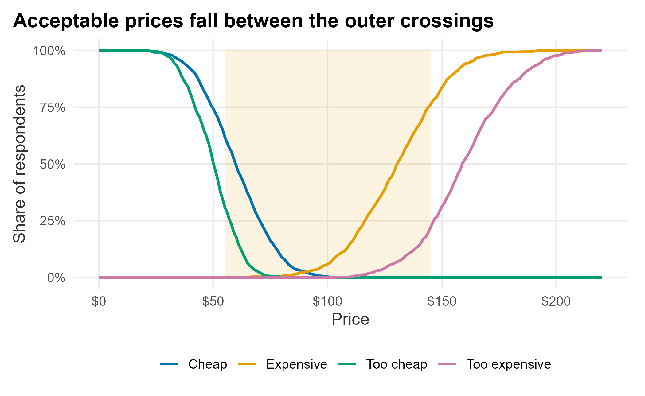
Figure 6.12: Van Westendorp price sensitivity curves
The shaded band is the range of acceptable prices between the point of marginal cheapness and the point of marginal expensiveness.
| indifference_price | optimal_price | range_lower | range_upper |
|---|---|---|---|
| 92 | 81 | 57.6 | 147.6 |
The acceptable range runs from roughly $58 to $148. This is not willingness to pay, but it bounds the prices fans are likely to find reasonable. It is a useful input to a pricing decision, not the decision itself.
6.6 Implementing revenue management in sports
These techniques are increasingly commoditized. The mechanics of forecasting and pricing are well understood, and ticketing platforms and marketplaces can already push changes across many games at once. We have covered the main considerations, but not all of them:
- Brand and consumer equity
- Setting initial prices
- Adjusting prices automatically
- Controlling cannibalization
- Public relations and perceived fairness
Lowering prices can hurt brand equity over time. Prospect theory explains why: changes in utility are asymmetric between gains and losses (Tudor Bodea 2012). If a fan feels they overpaid because prices later dropped, the negative reaction outweighs the goodwill of a deal. Not every price change feels fair. Keep behavioral economics in mind as you deploy a strategy.
Initial prices are hard to set, and reference prices are powerful. For a new product, such as a premium seating area, think carefully about the value proposition and gather some competitive intelligence; do not rely on a pro forma alone.
How should you evaluate and deploy prices? Set up an internal mechanism with sales, marketing, and operations at the table; pricing is one of the most important revenue levers. Make sure the technology is ready, too: how does a price reach the market, how is the website updated, and what policies bound how high or low a ticket can go? Your inventory-control protocols feed back into all of it. Raising the price in one section changes demand in another, and those links can sometimes be modeled with systems of equations. Finally, how fans respond depends on demand, team success, and the market. Exploiting an opportunity is not always wise. Qualitative research, including conjoint and Van Westendorp studies, can help you gauge the reaction before you commit.
6.7 Key concepts and chapter summary
Getting pricing right is central to an integrated marketing strategy, and it has both quantitative and qualitative parts. We covered:
- Inventory control
- Mechanical price-response functions
- Regression in more depth
- Forecasting and schedule analysis
- Event scoring
- Qualitative pricing research
We only skimmed a deep subject, but the basics are in place:
- Inventory is complex, and people perceive it differently. Understanding the differences matters, especially for discrete-choice models.
- Price-response functions are mathematical models you can tune to push volume or maximize revenue, and those goals may conflict.
- Regression rewards rigor. If you want to trust the results, evaluate the model methodically, and get a book on regression so you use it correctly.
- Schedules play an outsized role in revenue. We ranked games by attractiveness, which feeds directly into deciding where promotions will do the most good.
- Qualitative research, such as a Van Westendorp study, helps you understand how fans perceive prices before you set them.
The recurring lesson is to take an ensemble view: combine models, combine data sources, and combine quantitative results with judgment. Chapter 7 builds on the modeling here to score and prioritize leads, turning analysis into a tool the sales team uses every day.