9 Marketing mix modeling
The last chapter ended on an uncomfortable note. Promotions, and marketing in general, are hard to attribute: sales happen for many reasons at once, and the marketing that ran alongside them takes credit it may not deserve. Our next topic is as technically challenging as anything I have found working in sports analytics, but it is also the most directly useful to a marketing director: marketing mix modeling.
Marketing mix modeling, or MMM, is one disciplined answer to that question. Instead of trying to follow each customer from an ad to a purchase, it steps back and looks at the business from the top down. You line up spending in each marketing channel, day by day, with sales and use regression to estimate how much each channel contributed and what it returned. It is the same basic tool as the pricing regression in Chapter 6, applied to a different question and extended with several additional layers.
MMM has become popular again for a practical reason: the bottom-up, cookie-based attribution that dominated digital marketing for a decade is breaking down as privacy rules tighten and tracking gets harder. MMM never needed to follow individuals. It works from aggregate spend and aggregate outcomes, which makes it durable. It is not magic. It is correlational, it needs spending to vary, and it can mislead if used carelessly. With those limits in mind, it addresses the two questions a marketing director actually has: what is our marketing doing, and where should the next dollar go?
This chapter builds a small MMM end to end on a simulated season of spending. Because we built the data, we know the true answer. At each step, we can check what the model recovers and where it falls short.
9.1 What a marketing mix model is
At its core an MMM is a regression:
\[\begin{equation} \log(\text{sales}_t) = \text{baseline}_t + \sum_{c}\, \beta_c \cdot f(\text{spend}_{c,t}) + \varepsilon_t \tag{9.1} \end{equation}\]
Log daily sales are explained by a baseline, contributions from each marketing channel \(c\), and noise. The baseline represents demand the club would have had anyway, driven here by the season, day of week, and whether there is a home game. Three ideas separate a useful MMM from a naive “regress sales on spend” model:
- Carryover (adstock). Advertising you run today keeps working for days or weeks. A television campaign does not stop mattering the moment it airs.
- Diminishing returns (saturation). The first dollar into a channel does more than the millionth. Response curves bend.
- Controlling for the baseline. Most of the day-to-day movement in ticket sales has nothing to do with marketing. If you do not account for the season and the schedule, the model will hand marketing credit that belongs to a July weekend.
We will add these one at a time. The honest framing up front: an MMM tells you about association, not proof. It is strongest as a strategic, budget-level guide and weakest as a precise per-campaign scorecard. It complements experiments and attribution rather than replacing them.
9.2 The data
The marketing_mix_data set in the FOSBAAS package contains three seasons of daily records for our club. It includes tickets sold, ticket revenue, raw spending on five channels (television, radio, paid social, paid search, and email), and several calendar fields.
mmm <- FOSBAAS::marketing_mix_data
kable(head(mmm[, c("date","ticketSales","spendTv","spendRadio",
                   "spendSocial","spendSearch","spendEmail","seasonPhase")]),
      caption = "The first days of the marketing-mix data set.",
align = "c", format = "markdown", padding = 0)| date | ticketSales | spendTv | spendRadio | spendSocial | spendSearch | spendEmail | seasonPhase |
|---|---|---|---|---|---|---|---|
| 2022-01-01 | 1622 | 3200 | 1146 | 9071 | 3340 | 926 | offseason |
| 2022-01-02 | 1464 | 0 | 0 | 10731 | 3113 | 841 | offseason |
| 2022-01-03 | 1541 | 7136 | 1858 | 3295 | 4347 | 495 | offseason |
| 2022-01-04 | 1427 | 9002 | 2106 | 3281 | 4683 | 555 | offseason |
| 2022-01-05 | 1321 | 6199 | 1511 | 2712 | 3936 | 579 | offseason |
| 2022-01-06 | 1525 | 7651 | 2332 | 3293 | 4403 | 536 | offseason |
Sales follow the shape you would expect: quiet in the winter, rising through spring training and the early season, peaking in the summer, and tailing off (Figure 9.1).
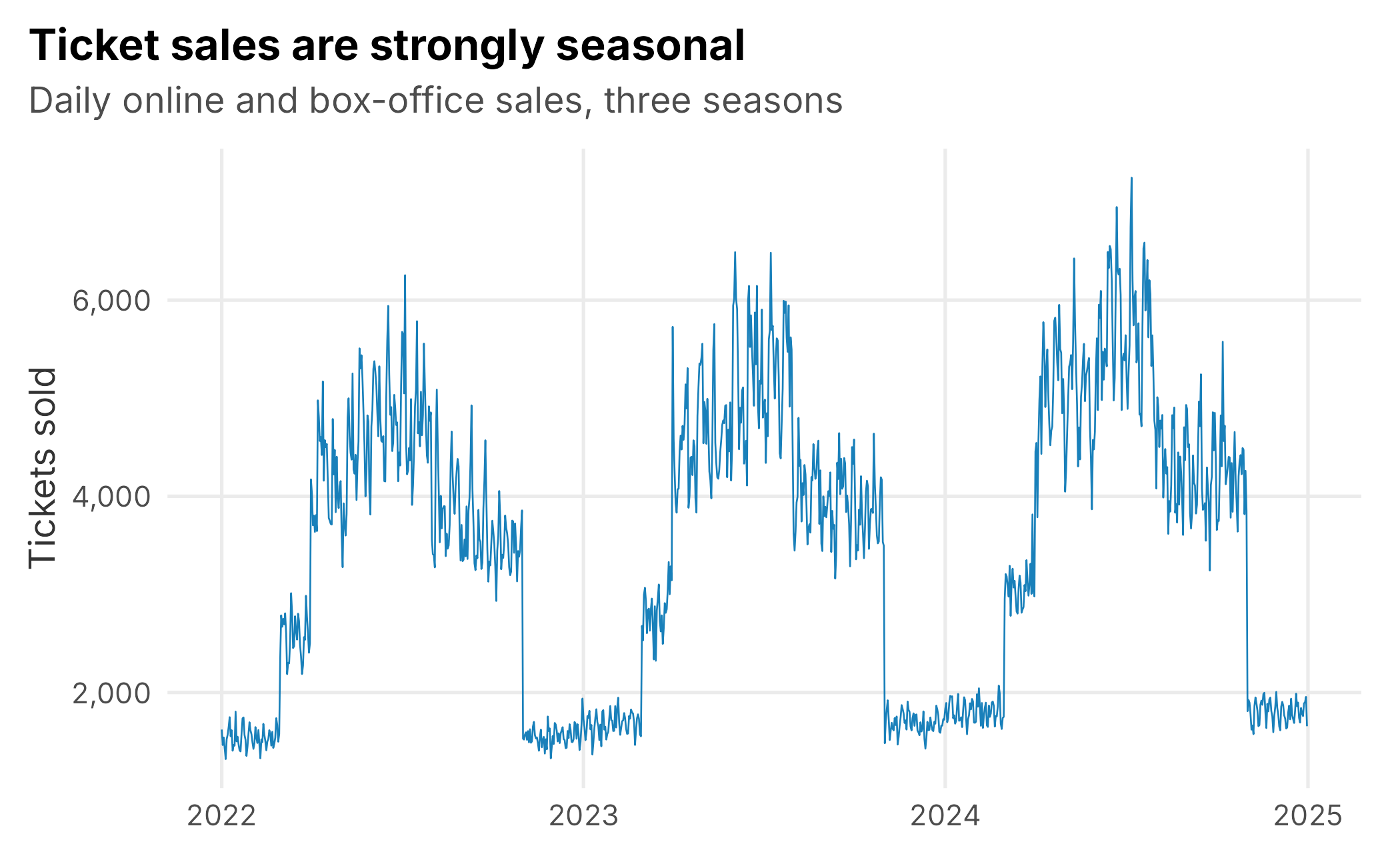
Figure 9.1: Daily ticket sales across three simulated seasons. Marketing has to be measured against this strong seasonal baseline.
Spending is seasonal too. The club leans in when demand is there, and campaigns cause channel spending to move in bursts (Figure 9.2).
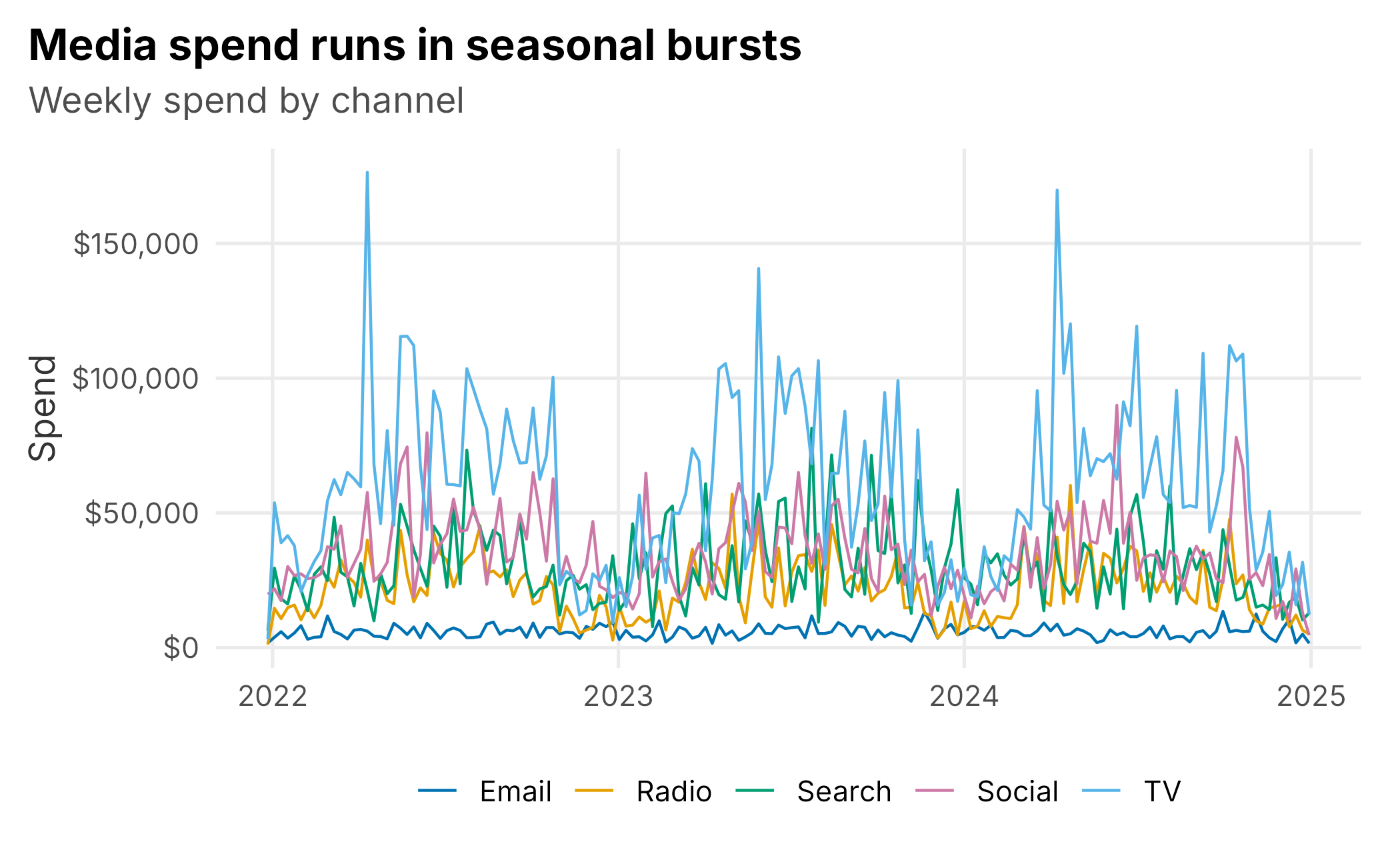
Figure 9.2: Weekly spend by channel. Television is the largest line; email is a small, steady, always-on channel.
Before modeling anything, it is tempting to just correlate spend with sales. Doing so is a good way to see why we need more than correlation.
raw_cor <- sapply(mmm[, channels], function(x) cor(x, mmm$ticketSales))
tv_radio <- cor(mmm$spendTv, mmm$spendRadio)
kable(data.frame(channel = channel_lab,
                 `cor with sales` = round(raw_cor, 2),
                 check.names = FALSE),
      caption = "Raw correlation of each channel's spend with ticket sales.",
align = "c", format = "markdown", padding = 0, row.names = FALSE)| channel | cor with sales |
|---|---|
| TV | 0.62 |
| Radio | 0.56 |
| Social | 0.47 |
| Search | 0.27 |
| 0.00 |
Two traps are already visible. First, email’s raw correlation with sales is about zero, even though email genuinely drives sales in these simulated data. Email is an always-on channel with relatively little independent variation, so a simple correlation misses its effect. Second, television and radio spending correlate with each other at 0.71 because they run in the same campaigns. That will make their effects difficult to separate, a problem we return to later.
9.3 Adstock: advertising carryover
Advertising has a memory. A television flight this week still nudges sales next week, fading over time. The standard way to model that is geometric adstock: each day’s effective advertising is today’s spend plus a decaying fraction of yesterday’s effective advertising.
\[\begin{equation} A_t = \text{spend}_t + \theta \, A_{t-1} \tag{9.2} \end{equation}\]
The decay rate \(\theta\) controls how long advertising lingers. A rate near zero means an ad is spent the day it runs; a rate near one means it echoes for weeks. The transform is a three-line function:
adstock <- function(x, rate) {
  out <- numeric(length(x)); out[1] <- x[1]
  for (i in 2:length(x)) out[i] <- x[i] + rate * out[i - 1]
  out
}
Applied to television spend, adstock smooths the spiky raw series into something that better resembles how the advertising actually works on demand (Figure 9.3).
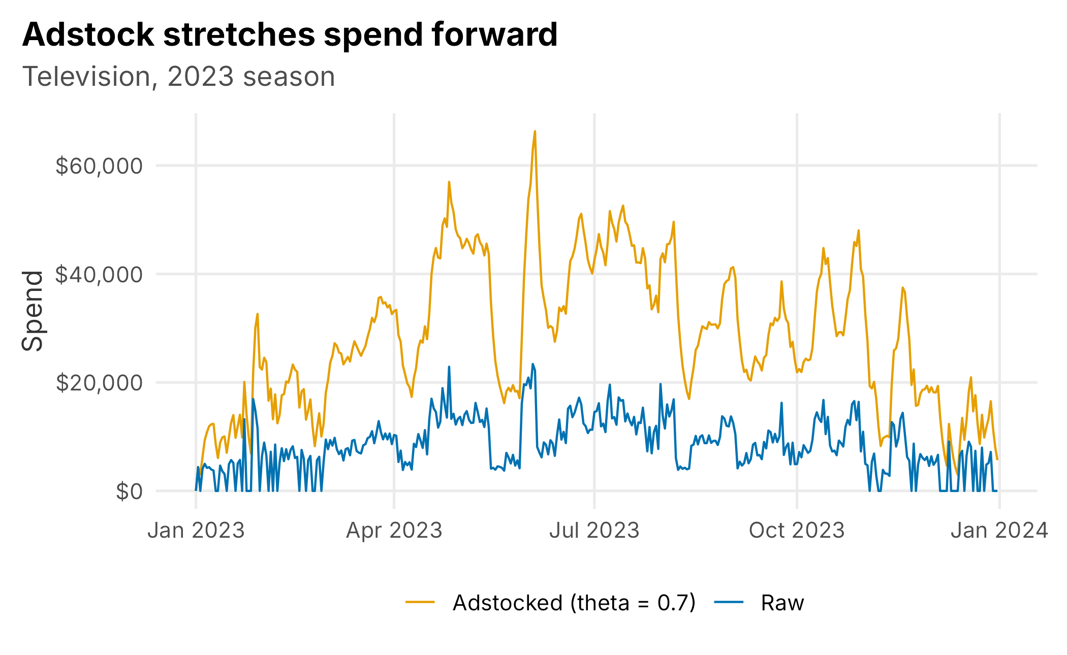
Figure 9.3: Raw versus adstocked television spend over one season. Carryover spreads each burst forward in time.
How do you choose the decay rate? This is where beginners get burned. A natural idea is to try many rates and keep the one whose adstocked series correlates most strongly with sales. Try it, and every channel comes back with a rate near the maximum:
rates <- seq(0, 0.9, by = 0.05)
y     <- log(mmm$ticketSales)
naive_rate <- sapply(channels, function(ch)
  rates[which.max(sapply(rates, function(r) cor(adstock(mmm[[ch]], r), y)))])
The reason is subtle: a high decay rate smooths the spending series into a slow seasonal wave, and any smooth series can correlate with the smooth seasonal sales curve. The grid is measuring smoothness rather than carryover. A better approach removes the predictable baseline, including season, day of week, and home games, from both sales and transformed spending. It then asks what carryover explains in the residual variation:
baseline <- lm(log(ticketSales) ~ dayOfWeek + seasonPhase + isGameDay +
                 I(as.numeric(date - min(date))/365), data = mmm)
resid_y  <- residuals(baseline)
resid_rate <- sapply(channels, function(ch)
  rates[which.max(sapply(rates, function(r) {
    a <- adstock(mmm[[ch]], r)
    x <- saturate(a, mean(a))
    resid_x <- residuals(lm(x ~ dayOfWeek + seasonPhase + isGameDay +
                              I(as.numeric(date - min(date))/365), data = mmm))
    cor(resid_x, resid_y)
  }))])

truth_theta <- c(spendTv = 0.70, spendRadio = 0.50, spendSocial = 0.30,
                 spendSearch = 0.10, spendEmail = 0.20)
kable(data.frame(channel = channel_lab,
                 `naive grid`   = naive_rate,
                 `residualized` = resid_rate,
                 `true rate`    = truth_theta, check.names = FALSE),
      caption = "Estimated adstock decay rates. The naive grid pins everything at 0.9; residualizing helps but is still noisy.",
align = "c", format = "markdown", padding = 0, row.names = FALSE)| channel | naive grid | residualized | true rate |
|---|---|---|---|
| TV | 0.9 | 0.65 | 0.7 |
| Radio | 0.9 | 0.60 | 0.5 |
| Social | 0.9 | 0.55 | 0.3 |
| Search | 0.9 | 0.80 | 0.1 |
| 0.9 | 0.75 | 0.2 |
Residualizing is much better. It recovers television’s long carryover and radio’s medium carryover, but it remains noisy and gets search and email wrong. The lesson is that adstock rates are only weakly identified from observational data. In practice, analysts constrain them with domain knowledge and priors. Television and brand campaigns may linger, while search is nearly immediate. Analysts should then test how sensitive their conclusions are to those choices. Because we built these data, we know the true rates and use them for the rest of the chapter.
carry <- truth_theta
ad <- as.data.frame(mapply(function(ch, r) adstock(mmm[[ch]], r), channels, carry))
names(ad) <- channels
9.4 Saturation: diminishing returns
The second transform captures the fact that channels wear out. Pouring more into a channel keeps adding sales, but each extra dollar adds less than the one before. A simple, well-behaved way to bend the response is the Hill curve. Its half-saturation point, \(K\), is the spending level at which the channel reaches half of its maximum effect.
\[\begin{equation} S(x) = \frac{x}{x + K} \tag{9.3} \end{equation}\]
Below \(K\) the channel is in its efficient range; well above it, extra spend barely moves the needle (Figure 9.4).
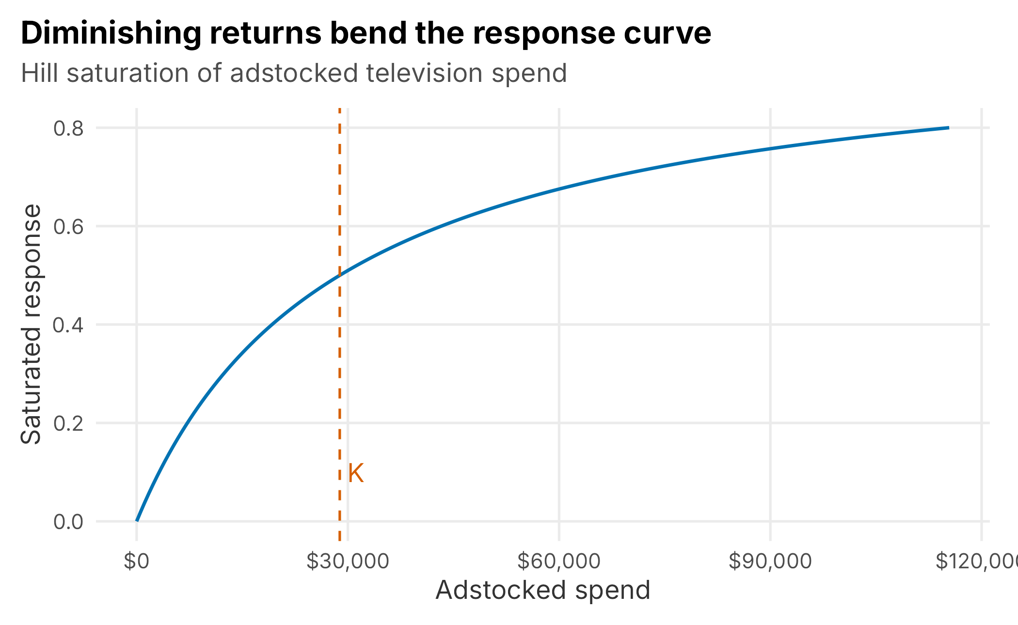
Figure 9.4: A saturation curve. Response rises steeply at first, then flattens; K marks the half-saturation point.
Like the decay rate, \(K\) is difficult to identify precisely from observational data. Production models constrain or estimate it with validation, prior information, and, when available, experimental evidence. For this teaching example, we set each channel’s half-saturation point to its mean adstocked spending. This convenient assumption places the observed channel near the responsive part of its curve; it is not a universal default.
half <- sapply(ad, mean)
sat  <- as.data.frame(mapply(function(ch) saturate(ad[[ch]], half[[ch]]), channels))
names(sat) <- channels
9.5 Fitting the model
Now we assemble the regression: log daily sales on the transformed channels plus the baseline controls. On this scale, each channel produces a multiplicative lift after predictions are transformed back to tickets, and transformed predictions remain positive.
model_df <- data.frame(
  logSales    = log(mmm$ticketSales),
  sat,
  dayOfWeek   = mmm$dayOfWeek,
  seasonPhase = mmm$seasonPhase,
  isGameDay   = mmm$isGameDay,
  trend       = as.numeric(mmm$date - min(mmm$date)) / 365)

fit <- lm(logSales ~ ., data = model_df)
Before reading the marketing coefficients, notice how much work the baseline does. A model with only the calendar controls already explains about 98% of the day-to-day variation in log sales; adding all five marketing channels lifts that to 98.7%. This does not mean marketing is unimportant. Marketing can drive a meaningful share of sales while explaining only a modest share of their variation. It also explains why the baseline must be modeled carefully: when it is wrong, marketing variables can absorb the error.
The estimated channel coefficients are the maximum log-lift each channel can add. Because this is simulated data, we can lay them next to the truth:
| channel | estimate | truth |
|---|---|---|
| TV | 0.140 | 0.16 |
| Radio | 0.077 | 0.09 |
| Social | 0.107 | 0.14 |
| Search | 0.090 | 0.11 |
| 0.023 | 0.06 |
Every channel comes back positive and in roughly the right order, with television and social carrying the largest per-unit effects. The estimates are pulled toward each other and are not perfect. The model especially understates email because its steady, always-on spending provides little independent variation from which to estimate an effect. That difficulty is real: owned channels with stable activity are often among the hardest to measure.
9.6 From coefficients to ROAS
Coefficients are not what a marketing director wants. They want to know how many tickets each channel contributed and what it returned per dollar. We get there by decomposition: predict sales with the model, predict again with one channel turned off, and attribute the difference to that channel. Dividing the resulting revenue by spending gives return on ad spend (ROAS).
price <- sum(mmm$ticketRevenue) / sum(mmm$ticketSales)
pred  <- predict(fit)

# Correct the retransformation bias that arises when exponentiating log predictions.
smear <- mean(exp(residuals(fit)))
fitted_sales <- smear * exp(pred)

roas <- lapply(channels, function(ch) {
  z <- sat; z[[ch]] <- 0
  off  <- predict(fit, newdata = data.frame(z,
            dayOfWeek = mmm$dayOfWeek, seasonPhase = mmm$seasonPhase,
            isGameDay = mmm$isGameDay, trend = model_df$trend))
  incr <- sum(smear * (exp(pred) - exp(off)))
  data.frame(channel = channel_lab[ch], tickets = incr,
             spend = sum(mmm[[ch]]),
             roas = incr * price / sum(mmm[[ch]]),
             share = incr / sum(fitted_sales))
}) |> bind_rows()

# The joint contribution is a separate counterfactual because individual
# turn-off contributions overlap in a multiplicative model.
all_off <- sat
all_off[] <- 0
base_pred <- predict(fit, newdata = data.frame(all_off,
              dayOfWeek = mmm$dayOfWeek, seasonPhase = mmm$seasonPhase,
              isGameDay = mmm$isGameDay, trend = model_df$trend))
joint_tickets <- sum(smear * (exp(pred) - exp(base_pred)))
joint_share <- joint_tickets / sum(fitted_sales)| channel | incremental tickets | spend | ROAS | share of sales |
|---|---|---|---|---|
| TV | 262,092 | $9,497,920 | $1.24 | 6.9% |
| Radio | 145,120 | $3,454,795 | $1.88 | 3.8% |
| Social | 198,141 | $5,515,079 | $1.61 | 5.2% |
| Search | 162,525 | $4,813,554 | $1.52 | 4.3% |
| 41,076 | $922,104 | $2.00 | 1.1% |
Two headline findings emerge. In the joint counterfactual, the five channels account for about 20% of fitted ticket sales; the rest is baseline demand the club would have had without marketing. The individual turn-off shares in the table should not be added because their multiplicative effects overlap. The channels also rank clearly by efficiency: email and radio return the most per dollar, while television, the largest line item, returns the least (Figure 9.5). That pattern matches the truth built into the simulation and can change a budget conversation.
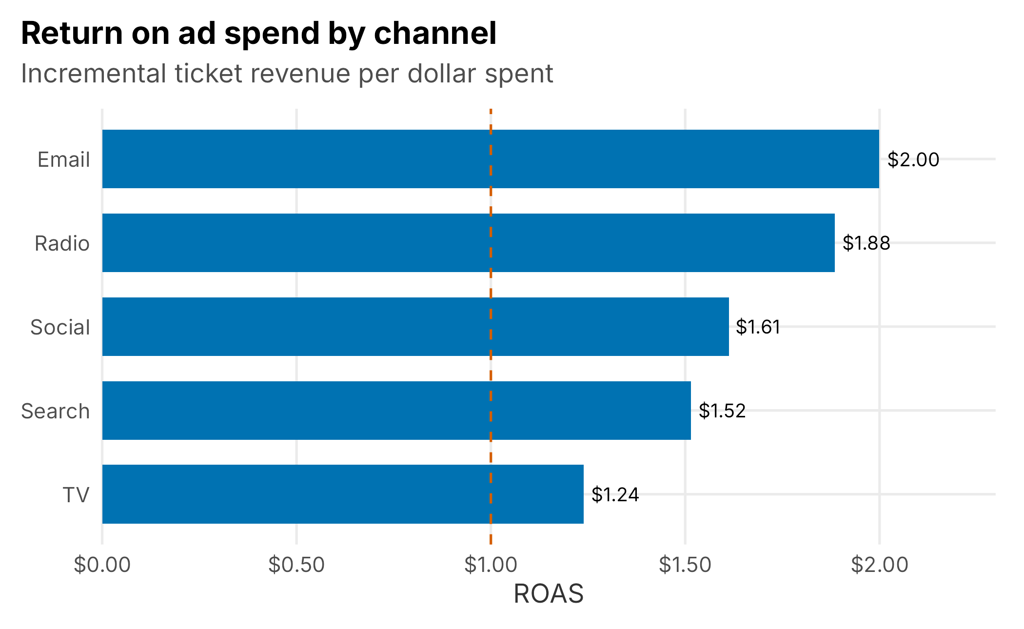
Figure 9.5: Return on ad spend by channel. The biggest channel is not the most efficient one.
9.7 Diminishing returns and the next dollar
ROAS is an average: revenue per dollar across everything spent. Budget decisions depend on the marginal dollar, meaning what the next dollar in a channel would add. The saturation curve lets us examine that question. By rerunning the model with a channel’s spending scaled up and down, we can trace its response curve (Figure 9.6).
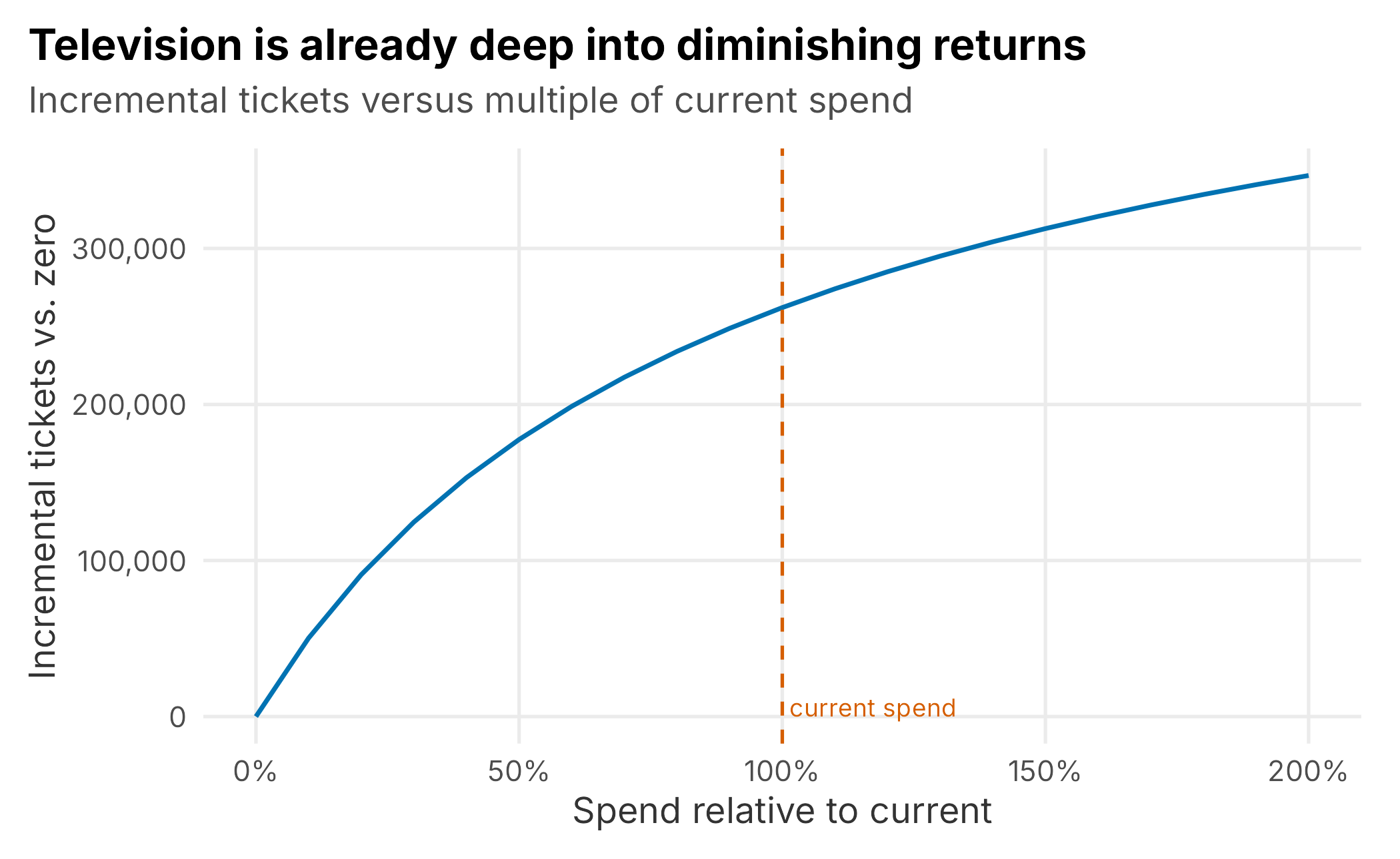
Figure 9.6: Television response curve. Incremental tickets rise quickly at low spend and flatten; the vertical line marks current spend.
The curve tells a story that a single ROAS number hides. Television’s first dollars work hard, but current spending sits well into the flatter part of the curve. Doubling television spending would add far fewer tickets per dollar than the channel generated at lower levels. Read together with the ROAS table, the result suggests that television may be over-invested at the margin. Subject to the model’s uncertainty and operational constraints, moving money toward more efficient channels could buy more tickets. That reallocation logic, rather than a single scorecard, is the real product of an MMM.
9.8 When channels move together
Return to the problem we flagged early: television and radio spending correlate at 0.71 because they run in the same campaigns. When two predictors move together, a plain regression struggles to split their effects. It can credit one and debit the other almost arbitrarily, and small changes in the data can swing the estimates. We illustrate that instability by refitting the marketing part of the model on bootstrap resamples of individual days. This simple bootstrap keeps the example compact; production work should use time-aware blocks that preserve serial dependence.
# Remove the baseline, then model the leftover with the marketing channels.
Xc <- model.matrix(~ dayOfWeek + seasonPhase + isGameDay + trend, data = model_df)
rX <- sapply(channels, function(ch) residuals(lm(sat[[ch]] ~ Xc - 1)))

set.seed(7)
boot <- replicate(150, {
  i <- sample(nrow(rX), replace = TRUE)
  ols   <- coef(lm(resid_y[i] ~ rX[i, ] - 1))[1:2]
  ridge <- as.matrix(coef(glmnet(rX[i, ], resid_y[i], alpha = 0,
             lambda = 0.02, intercept = FALSE)))[c("spendTv","spendRadio"), 1]
  c(ols, ridge)
})
The remedy is ridge regression, which we can fit with glmnet (Friedman et al. 2025). Ridge adds a penalty on the size of the coefficients, which nudges correlated predictors to share an effect rather than fight over it. It accepts a little bias in exchange for a large drop in variance. The bootstrap makes the trade visible (Figure 9.7): the ordinary estimate of the television coefficient bounces around with a standard deviation of 0.027, while the ridge estimate is far steadier at 0.017.
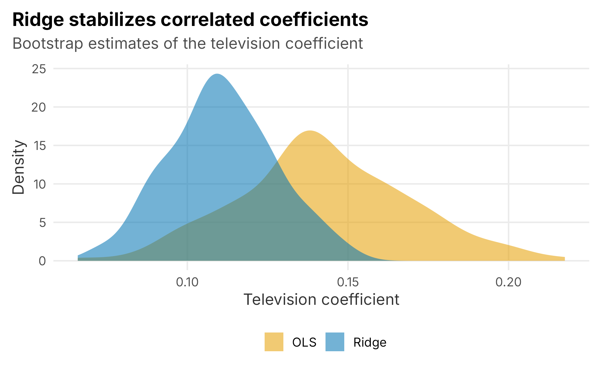
Figure 9.7: Bootstrap distribution of the television coefficient. Ridge produces a much tighter, more stable estimate than ordinary least squares.
Ridge is not a cure for bad data. If television and radio never move independently, no method can fully separate them; the defensible choice is to model their combined effect and report the limitation. When channels are correlated but retain some independent variation, regularization can make estimates more stable. Stability alone does not establish accuracy, so the penalty and predictive performance still need validation. Elastic net, which glmnet also fits, extends the same idea and can shrink uninformative channels to zero.
9.9 Does marketing work harder at some times?
A season is not uniform, and neither is marketing’s payoff. We can ask the model how each channel’s return changes across the phases of the year by running the same turn-off decomposition within each phase (Table 9.6).
| offseason | spring | early | mid | late | |
|---|---|---|---|---|---|
| TV | 0.79 | 0.96 | 1.33 | 1.57 | 1.24 |
| Radio | 1.15 | 1.34 | 2.12 | 2.44 | 1.93 |
| Social | 0.89 | 1.36 | 1.89 | 2.16 | 1.67 |
| Search | 0.79 | 1.27 | 1.99 | 2.03 | 1.63 |
| 0.96 | 1.63 | 2.77 | 3.04 | 2.29 |
The dominant pattern is unsurprising: every channel returns more in-season than in the offseason because more tickets are selling then. Email and radio are the most efficient channels in every phase, while television is the least efficient. This is the same ranking as before, now with timing attached. The result suggests concentrating spending when demand is warm and using the more efficient channels throughout the year.
A word of caution closes the section. Isolating a channel’s own seasonal rhythm is much harder. For example, does social perform especially well early in the season after accounting for the general demand cycle? Spending and demand rise together, and the model cannot fully separate them. The table blends effectiveness with the demand cycle, so treat it as directional guidance on when to spend rather than proof that a channel has a special season.
9.10 A note on trust
We have skipped several steps that a production MMM should treat as mandatory. Hold out the most recent stretch of time, refit on the earlier observations, and check whether the model predicts the held-out period better than a naive seasonal benchmark. If it does not, its ROAS estimates are not strong enough to guide spending. Use time-aware resampling and put uncertainty bands on every ROAS estimate and response curve; a point estimate of “1.9” with a wide interval supports a different decision from a precise estimate. Finally, compare the model with any experiments the organization has run.
The deeper caveats are the ones this chapter demonstrated rather than merely asserted. Adstock and saturation are weakly identified, so use priors and test sensitivity. Correlated channels cannot always be separated, so regularize where appropriate and report what remains unresolved. Because the model is correlational, it needs spending to vary and can be fooled by omitted factors that move with both spending and sales. An MMM is useful for steering a budget at the strategic level. It is much weaker for deciding which specific campaign deserves credit, and treating it otherwise undermines its value.
9.11 Key concepts and chapter summary
Marketing mix modeling answers a top-down question that per-customer attribution cannot: across everything we spent, what did each channel contribute, and where should the next dollar go? We built one from the ground up on a simulated season and checked it against the truth.
- Adstock captures advertising carryover with a single decay rate; it is weakly identified, so set it from priors and test sensitivity.
- Saturation captures diminishing returns; constrain or estimate the half-saturation point with validation, prior information, and experimental evidence when available.
- The baseline matters most. Season, day of week, and games explain the bulk of sales; model them well or marketing will absorb the error.
- Decomposition turns coefficients into ROAS and contribution, which is what a budget owner actually uses. Here television was the largest and least efficient channel.
- Response curves, not average ROAS, guide the marginal dollar. Television was deep into diminishing returns, arguing for reallocation.
- Ridge regression stabilizes the correlated channels that break ordinary regression, trading a little bias for much less variance.
Above all, an MMM is a strategic guide with honest limits. It tells you the shape of your marketing’s contribution and where the leverage is, provided your spending varied enough to leave a signal and you resist reading it as proof.
Chapter 10 stays with media but changes the lens. It moves from modeling what marketing did to reading the media data itself: linear-television ratings and direct-to-consumer streaming and subscription feeds that measure how many people a club actually reaches.