13 Building maps
Almost every customer record a club owns carries a location. In Chapter 7 we set geography aside with a promise to come back to it, and this is where we do. Where fans live shapes nearly everything a business staff touches: how far people will travel for a weeknight game, where to buy billboards, which suburbs to target for group sales, how to draw a season-ticket sales territory, and where the next fan is most likely to come from. A map turns a column of coordinates into something you can reason about and, just as important, something you can put in front of a decision-maker who will never read a regression table.
R is not a full geographic information system. If your job is heavy-duty spatial analysis you will eventually want a dedicated tool like ArcGIS. But the modern R spatial stack, built around the sf package (Pebesma 2025), is more than good enough for the maps a club actually needs, and it keeps the work inside the same reproducible workflow as the rest of your analysis. This chapter builds five maps from our own customer data, each answering a different question, using only packages that ship their own data or install cleanly with no API key. You can also enrich these maps using a variety of sources such as US Census data.
13.1 The data behind a map
We will use the demographic file from Chapter 2, the same demographic_data that fed the lead-scoring model. Each of its 200,000 rows is a customer, and three of its columns are geographic: latitude, longitude, and distance, the last being straight-line miles from the ballpark.
demos <- FOSBAAS::demographic_data

geo <- demos |>
dplyr::select(custID, latitude, longitude, distance, county, hhIncome)| custID | latitude | longitude | distance | county | hhIncome |
|---|---|---|---|---|---|
| MBT9G0X70NTI | 36.05 | -86.09 | 48.34 | tennessee,wilson | 2866 |
| QTR3JJJ5J6GJ | 37.12 | -86.07 | 77.09 | kentucky,edmonson | 552 |
| HOMV3XQW32LW | 36.10 | -87.45 | 46.72 | tennessee,dickson | 2274 |
| RJ7CCATUH4Q1 | 37.02 | -86.23 | 65.45 | kentucky,warren | 1773 |
| 9GZT5Z5AOMKV | 36.46 | -86.85 | 19.28 | tennessee,robertson | 1951 |
| S0Y0Y2454IU2 | 35.58 | -87.63 | 69.20 | tennessee,lewis | 3244 |
Two details matter before we draw anything. First, this customer base is centered on Nashville, our fictional club’s home, with smaller clusters around the mid-South cities the club also markets to; the same regional footprint appeared in the media chapter, Chapter 10. Second, hhIncome is a scaled index rather than real dollars, so we will read it in relative terms, high versus low, not as a literal income figure. That is a fine habit with any purchased demographic field, whose exact units are often opaque.
13.2 Boundaries without a download
A map needs a backdrop: the outlines of states and counties. You can download shapefiles from the Census Bureau, but the maps package (Deckmyn 2025) already ships county and state polygons, and we can convert them to sf objects with one function. Conveniently, its county identifiers use the same "state,county" form as our county column, which will let us join data to geography by name later.
counties <- sf::st_as_sf(maps::map("county", fill = TRUE, plot = FALSE)) |>
  sf::st_set_crs(4326)
counties$county <- sub(":.*$", "", counties$ID)   # drop island sub-parts

states <- sf::st_as_sf(maps::map("state", fill = TRUE, plot = FALSE)) |>
  sf::st_set_crs(4326)
Every spatial object carries a coordinate reference system (CRS), the rule for turning coordinates into positions on the curved earth. Raw longitude and latitude live in CRS 4326 (plain degrees). For a regional map we reproject into an equal-area CRS so that a hexagon or a circle keeps its true relative size instead of stretching toward the poles. Conus Albers (EPSG 5070) is a standard choice for the continental United States.
counties_ea <- sf::st_transform(counties, EA)
states_ea   <- sf::st_transform(states,   EA)
We will look at the same region repeatedly, so it helps to define the viewing windows once: a wide regional frame and a tight Nashville-metro frame. This small helper takes a longitude/latitude box, reprojects it, and returns a coord_sf that both crops the map and draws it in the equal-area projection.
region_box <- c(xmin = -91.0, xmax = -78.0, ymin = 30.5, ymax = 39.5)
metro_box  <- c(xmin = -87.9, xmax = -85.7, ymin = 35.3, ymax = 36.9)

crop_to <- function(box) {
  bb <- sf::st_bbox(c(xmin = box[["xmin"]], xmax = box[["xmax"]],
                      ymin = box[["ymin"]], ymax = box[["ymax"]]), crs = 4326)
  p  <- sf::st_bbox(sf::st_transform(sf::st_as_sfc(bb), EA))
  coord_sf(xlim = p[c("xmin", "xmax")], ylim = p[c("ymin", "ymax")],
           crs = sf::st_crs(EA), datum = NA, expand = FALSE)
}

major_cities <- tibble::tribble(
  ~city,          ~longitude, ~latitude,
  "Nashville",      -86.7816,  36.1627,
  "Memphis",        -90.0490,  35.1495,
  "Knoxville",      -83.9207,  35.9606,
  "Chattanooga",    -85.3097,  35.0456,
  "Birmingham",     -86.8025,  33.5186,
  "Louisville",     -85.7585,  38.2527,
  "Lexington",      -84.5037,  38.0406,
  "Atlanta",        -84.3880,  33.7490,
  "Charlotte",      -80.8431,  35.2271,
  "Asheville",      -82.5540,  35.5951
) |>
  sf::st_as_sf(coords = c("longitude", "latitude"), crs = 4326) |>
  sf::st_transform(EA)

add_major_cities <- function(label_size = 2.3) {
  list(
    geom_sf(data = major_cities, shape = 21, size = 1.6,
            fill = "white", color = "grey20", stroke = 0.35),
    geom_sf_text(data = major_cities, aes(label = city),
                 size = label_size, color = "grey20", nudge_y = 25000,
                 check_overlap = TRUE)
  )
}

# For the metro zoom we want a different set of labels: Nashville plus the
# suburbs a sales staff would actually name. These give the tight view enough
# context to orient a reader who does not know the local geography.
metro_places <- tibble::tribble(
  ~city,            ~longitude, ~latitude,
  "Nashville",        -86.7816,  36.1627,
  "Franklin",         -86.8689,  35.9251,
  "Brentwood",        -86.7822,  36.0331,
  "Murfreesboro",     -86.3903,  35.8456,
  "Smyrna",           -86.5186,  35.9828,
  "Mt. Juliet",       -86.5186,  36.2003,
  "Hendersonville",   -86.6200,  36.3048,
  "Gallatin",         -86.4467,  36.3884,
  "Clarksville",      -87.3595,  36.5298,
  "Columbia",         -87.0353,  35.6151
) |>
  sf::st_as_sf(coords = c("longitude", "latitude"), crs = 4326) |>
  sf::st_transform(EA)

# White-backed labels so the names stay legible over the dark core hexes, the
# same treatment used for the catchment rings later in the chapter.
add_metro_places <- function(label_size = 2.2) {
  list(
    geom_sf(data = metro_places, shape = 21, size = 1.8,
            fill = "white", color = "grey20", stroke = 0.4),
    geom_sf_label(data = metro_places, aes(label = city),
                  size = label_size, color = "grey15", fill = "white",
                  alpha = 0.8, label.size = 0, label.padding = unit(0.6, "mm"),
                  nudge_y = 5500)
  )
}
13.3 Plotting customers as points
The simplest map places one dot per customer. With sf, a geom_sf layer draws the boundaries and a second draws the points; ggplot2 handles the projection. Two hundred thousand overlapping dots would be an ink-blot, so we take a random sample and make each dot small and semi-transparent, which lets density show through as darker areas.
set.seed(44)
sample_pts <- demos[sample(nrow(demos), 8000), ] |>
  sf::st_as_sf(coords = c("longitude", "latitude"), crs = 4326) |>
  sf::st_transform(EA)

ggplot() +
  geom_sf(data = counties_ea, fill = "#f4f6f9", color = HAIRLINE, linewidth = 0.05) +
  geom_sf(data = states_ea,   fill = NA, color = STATE_LN, linewidth = 0.3) +
  geom_sf(data = sample_pts, color = plot_palette[1], size = 0.25, alpha = 0.35) +
  add_major_cities() +
  crop_to(region_box) +
  labs(title = "Where the customers are",
       subtitle = "A random sample of 8,000 accounts; Nashville anchors a mid-South footprint",
       caption = "Source: demographic_data (simulated).") +
  theme_map()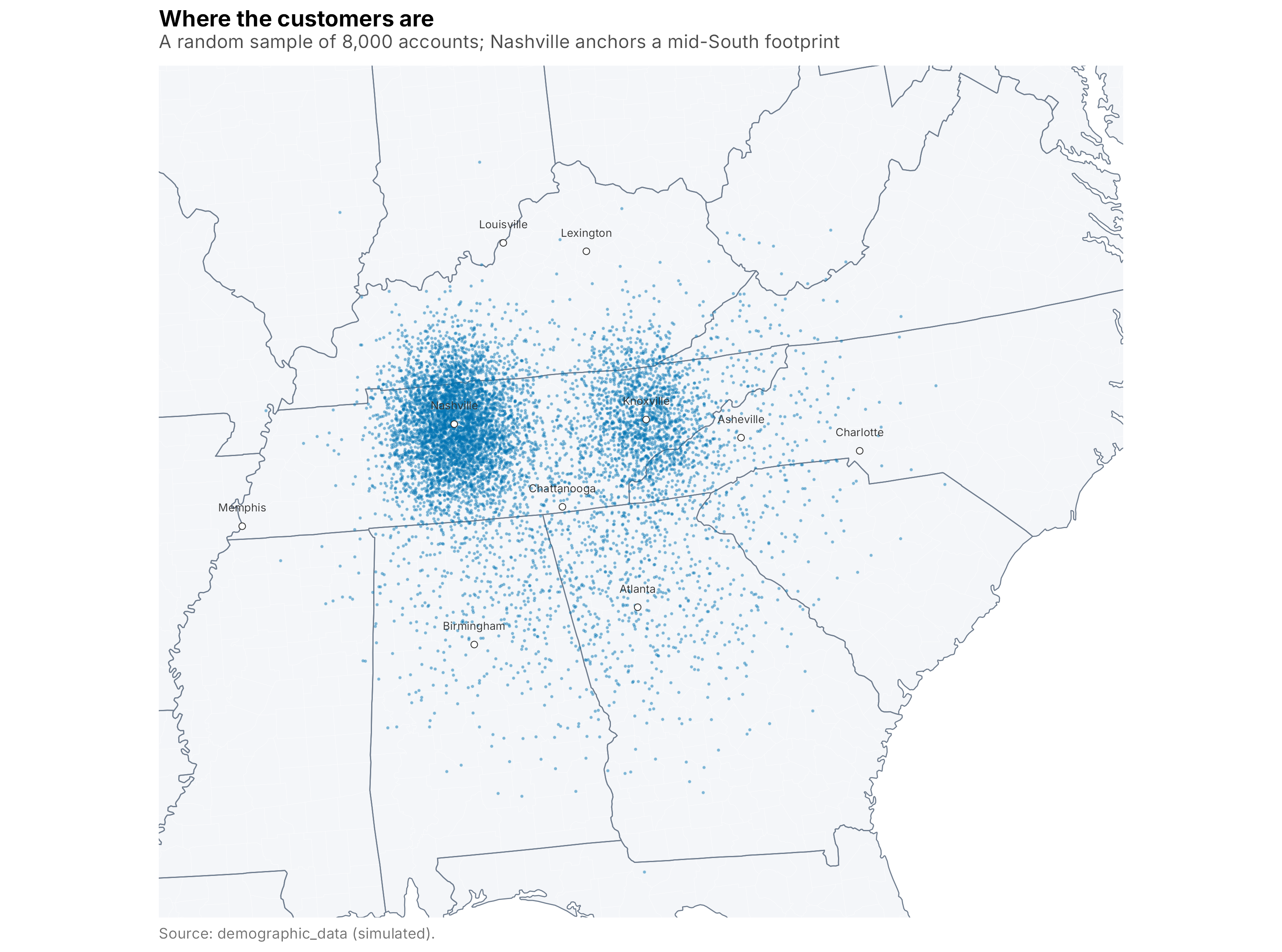
Figure 13.1: A sample of customers as points over the region
The point map already tells a story: a dense core around Nashville, a clear secondary cluster to the east around Knoxville, and thinner scatter across the surrounding states. It is a good first look, but points do not quantify density well; where dots pile up you cannot tell whether a spot holds ten customers or ten thousand. For that we need to bin.
13.4 Binning density into hexagons
A cleaner way to show density is to divide the map into equal cells and count the customers in each. Hexagons are the usual choice because, unlike squares, every neighbor is the same distance away, which avoids the visual artifacts a square grid produces. We use Uber’s H3 system through the h3jsr package (O’Brien 2023), which assigns every point on earth to a hexagonal cell at a chosen resolution. Lower resolutions mean bigger hexes.
The steps are always the same: assign each customer to a cell, count customers per cell, then turn the cells that contain customers into polygons.
build_hex <- function(res) {
  cells <- h3jsr::point_to_cell(demos[, c("longitude", "latitude")], res = res)
  counts <- tibble::tibble(h3 = cells) |>
    dplyr::count(h3, name = "customers")
  h3jsr::cell_to_polygon(counts$h3) |>
    sf::st_sf(geometry = _) |>
    dplyr::mutate(customers = counts$customers) |>
    sf::st_transform(EA)
}

hex_region <- build_hex(4)   # coarse hexes for the wide view
hex_metro  <- build_hex(6)   # fine hexes for the metro zoom
Because counts range from a single customer to many thousands, we fill on a log scale so the busy core does not wash out everything else.
ggplot() +
  geom_sf(data = states_ea, fill = LAND, color = HAIRLINE, linewidth = 0.15) +
  geom_sf(data = hex_region, aes(fill = customers), color = NA) +
  geom_sf(data = states_ea, fill = NA, color = STATE_LN, linewidth = 0.3) +
  add_major_cities() +
  fill_blue("Customers\nper hex") +
  crop_to(region_box) +
  labs(title = "Customer density across the region",
       subtitle = "Each hexagon holds the customers whose home falls inside it (H3 resolution 4)",
       caption = "Source: demographic_data (simulated).") +
  theme_map()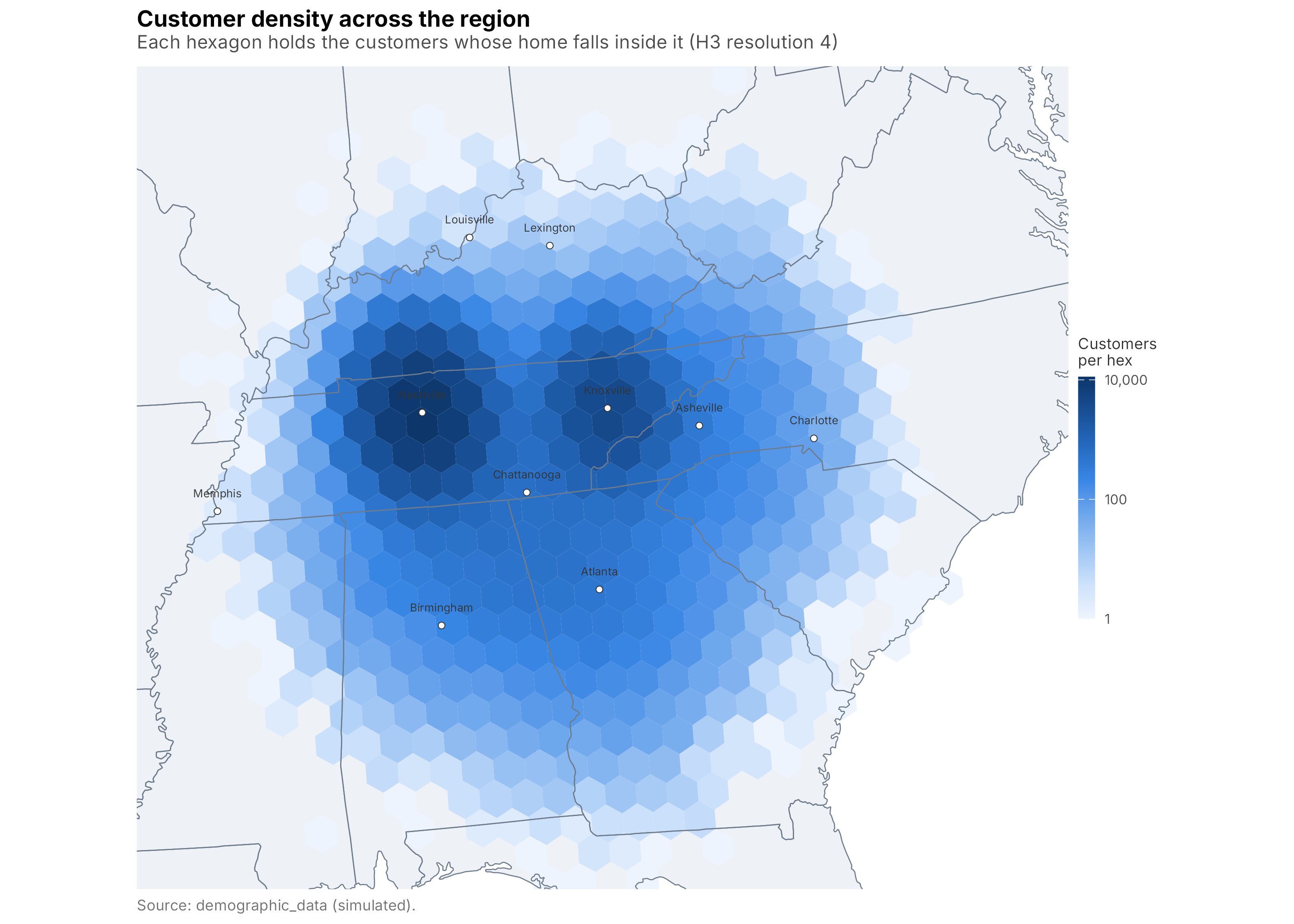
Figure 13.2: Customer density on an H3 hexagonal grid, regional view
The densest single hex holds about 11,100 customers. Zooming to the metro with finer hexes shows the internal structure the regional view flattens, the way density falls off from the core into the suburban counties. Notice one change from the regional map: within the metro the per-hex counts span a much narrower range, roughly a factor of four around the middle rather than the orders of magnitude we saw across the region. A log scale here would waste most of the color ramp on the empty rural fringe and bunch every populated hex into a single dark shade, so we switch to a square-root transform, which spreads the core and its suburbs across the full ramp and lets the falloff actually show. The transform is a design choice like the palette: match it to the range of the data in front of you.
One more layer makes the metro view read like a real map: the highways. Density on its own is a smooth blob, but overlaying the interstate network shows why it has the shape it does, because people live and commute along the corridors. There is no bundled road dataset the way there is for county boundaries, so we fetched the centerlines once from the Census Bureau’s TIGER/Line files with the tigris package (Walker 2025), which needs no API key. The code below is how the file was built; it is not run when the book renders. We kept only the two route types worth showing, interstates and US highways, cropped them to the metro window, and saved the result to files/metro_roads.rds so the chapter still renders with no network access.
# Run once to create files/metro_roads.rds (NOT evaluated at render time).
library(tigris)
options(tigris_use_cache = TRUE)

metro_sfc <- sf::st_as_sfc(sf::st_bbox(
  c(xmin = -87.9, xmax = -85.7, ymin = 35.3, ymax = 36.9), crs = 4326))

roads <- tigris::primary_secondary_roads("TN", year = 2022) |>
  dplyr::filter(RTTYP %in% c("I", "U")) |>       # I = Interstate, U = US highway
  dplyr::select(name = FULLNAME, type = RTTYP) |>
  sf::st_zm(drop = TRUE) |>                       # drop unused Z/M dimensions
  sf::st_transform(4326)

roads <- sf::st_crop(roads, sf::st_bbox(metro_sfc))
saveRDS(roads, "files/metro_roads.rds")
At render time we simply read that small file back and reproject it, then draw the interstates as a bold dark line and the US highways as a thinner grey one so the hierarchy is clear.
metro_roads <- readRDS("files/metro_roads.rds") |>
  sf::st_transform(EA)

add_metro_roads <- function() {
  list(
    geom_sf(data = dplyr::filter(metro_roads, type == "U"),
            color = "grey35", linewidth = 0.25, alpha = 0.6),
    geom_sf(data = dplyr::filter(metro_roads, type == "I"),
            color = "grey15", linewidth = 0.55)
  )
}
ggplot() +
  geom_sf(data = counties_ea, fill = LAND, color = HAIRLINE, linewidth = 0.1) +
  geom_sf(data = hex_metro, aes(fill = customers), color = NA) +
  geom_sf(data = counties_ea, fill = NA, color = HAIRLINE, linewidth = 0.2) +
  add_metro_roads() +
  geom_sf(data = states_ea, fill = NA, color = STATE_LN, linewidth = 0.3) +
  add_metro_places() +
  fill_blue("Customers\nper hex", trans = "sqrt") +
  crop_to(metro_box) +
  labs(title = "Customer density around Nashville",
       subtitle = "H3 resolution 6, with interstates and US highways for context",
       caption = "Source: demographic_data (simulated); roads from US Census TIGER/Line.") +
  theme_map()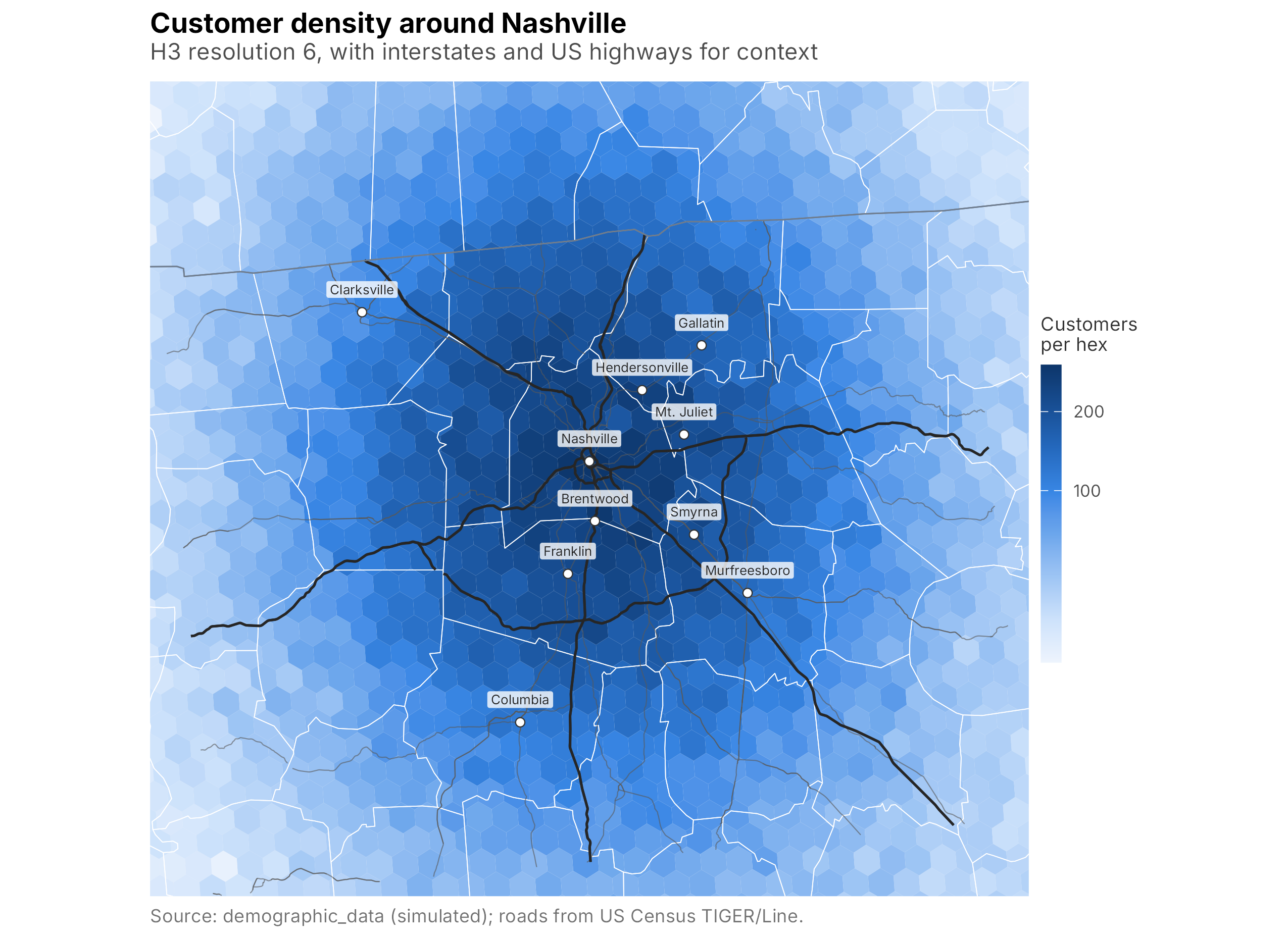
Figure 13.3: Customer density around Nashville, metro view
Labeling the suburbs is what makes this view actionable. The bare hex grid shows that density falls off from the core, but a reader who does not know middle Tennessee cannot tell one bright cell from another. With Franklin, Brentwood, Murfreesboro, and the rest marked, the map reads as a business geography: the affluent southern corridor through Brentwood and Franklin, the fast-growing counties to the southeast around Murfreesboro and Smyrna, and the lakeside communities to the north around Hendersonville and Gallatin. Those are the names a group-sales or season-ticket conversation actually uses, so putting them on the map lets a decision-maker connect the color to a place they already have opinions about. The highways add the same kind of context in a different register: the density does not spill out evenly in all directions but stretches along the interstate corridors, a reminder that drive time, not straight-line distance, is what really shapes where a club’s customers live.
13.5 Choropleths: shading known areas
Hexes are invented cells. Often you want to shade areas people already recognize, counties, ZIP codes, sales territories, because a decision is made at that level. A map that shades a region by a value is a choropleth.
We could assign each customer to a county with a spatial join, sf::st_join, which is the general tool when all you have is raw coordinates. But our data already carries a county label, so we can skip the geometry entirely: count customers per county, then join those counts to the county polygons by name. When a usable key exists, use it; a name join is faster and less error-prone than a point-in-polygon join.
county_counts <- demos |>
  dplyr::count(county, name = "customers")

counties_ea <- counties_ea |>
  dplyr::left_join(county_counts, by = "county")

ggplot() +
  geom_sf(data = counties_ea, aes(fill = customers),
          color = HAIRLINE, linewidth = 0.05) +
  geom_sf(data = states_ea, fill = NA, color = STATE_LN, linewidth = 0.3) +
  add_major_cities() +
  fill_blue("Customers") +
  crop_to(region_box) +
  labs(title = "Customer count by county",
       subtitle = "Counties with no customers are left unshaded",
       caption = "Source: demographic_data (simulated).") +
  theme_map()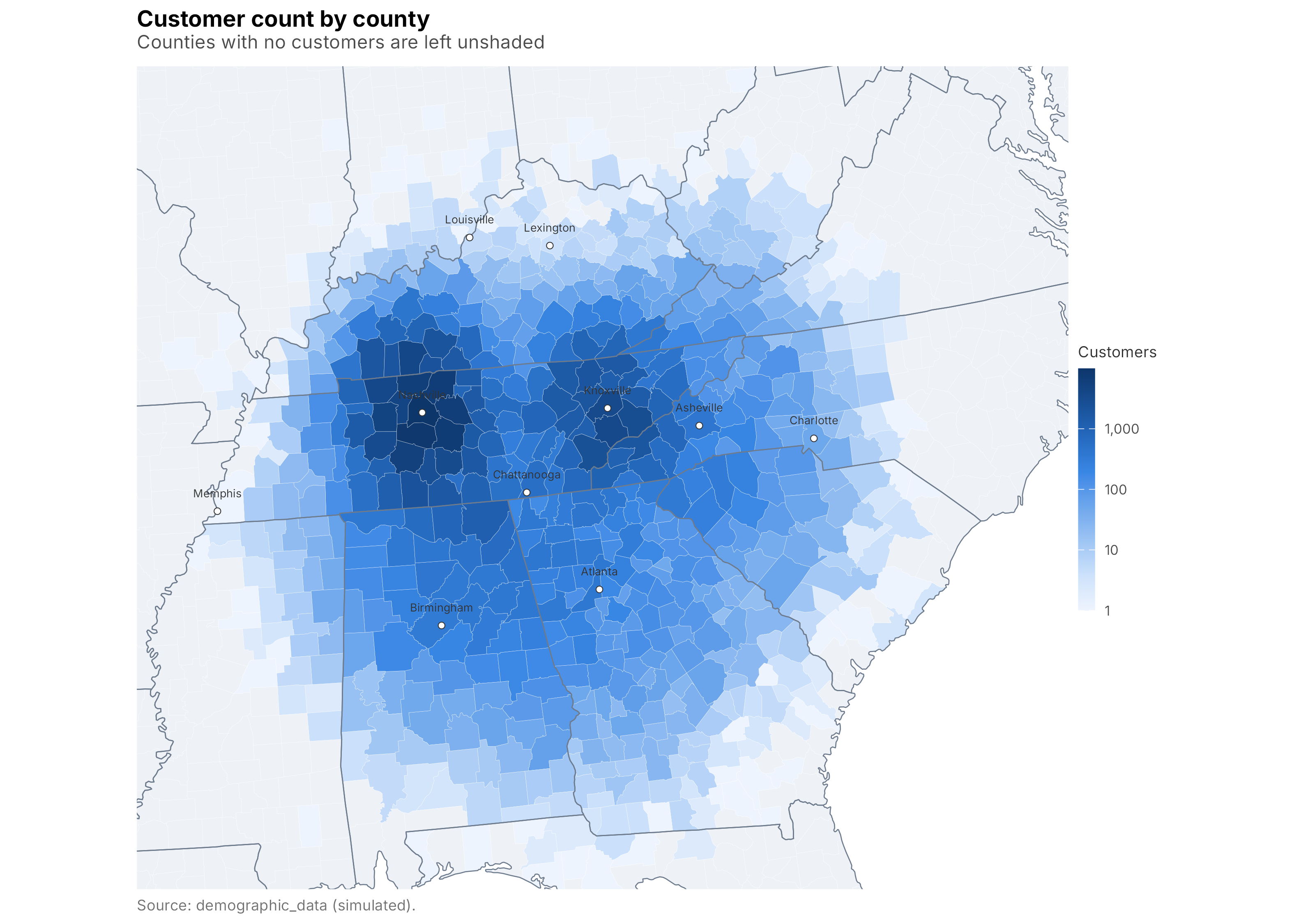
Figure 13.4: Customer count by county
The counties that dominate are exactly the ones you would guess: the home county and its fast-growing suburban neighbors.
Color is not decoration on a choropleth. The same county counts can feel different when the palette changes, even when the data, geography, and scale are identical. The blue ramp used so far is fine, but it was hand-built and only checked by eye. The viridis family (Garnier 2024) takes the guesswork out: every palette in it is perceptually uniform, meaning equal steps in the data map to equal steps in apparent color, and all are engineered to stay readable for the most common forms of color-vision deficiency (one, cividis, is tuned specifically for it and for grayscale). That matters more than it sounds, because a map that gets printed in black and white, or read by one of the roughly one in twelve men with red-green color blindness, should still carry its message. Even within viridis, though, the choice of palette changes the emphasis. Here is the county map twice, once with mako and once with cividis.
county_palette_map <- function(option, title) {
  ggplot() +
    geom_sf(data = counties_ea, aes(fill = customers),
            color = HAIRLINE, linewidth = 0.05) +
    geom_sf(data = states_ea, fill = NA, color = STATE_LN, linewidth = 0.3) +
    add_major_cities(label_size = 1.9) +
    viridis::scale_fill_viridis(
      name = "Customers", option = option, trans = "log10",
      labels = label_comma(accuracy = 1), na.value = LAND,
      guide = guide_colourbar(title.position = "top", ticks.colour = "white",
                              frame.colour = NA)
    ) +
    crop_to(region_box) +
    labs(title = title, caption = "Source: demographic_data (simulated).") +
    theme_map() +
    theme(legend.position = "bottom")
}

county_palette_map("mako", "Mako") +
  county_palette_map("cividis", "Cividis") +
  patchwork::plot_layout(guides = "collect")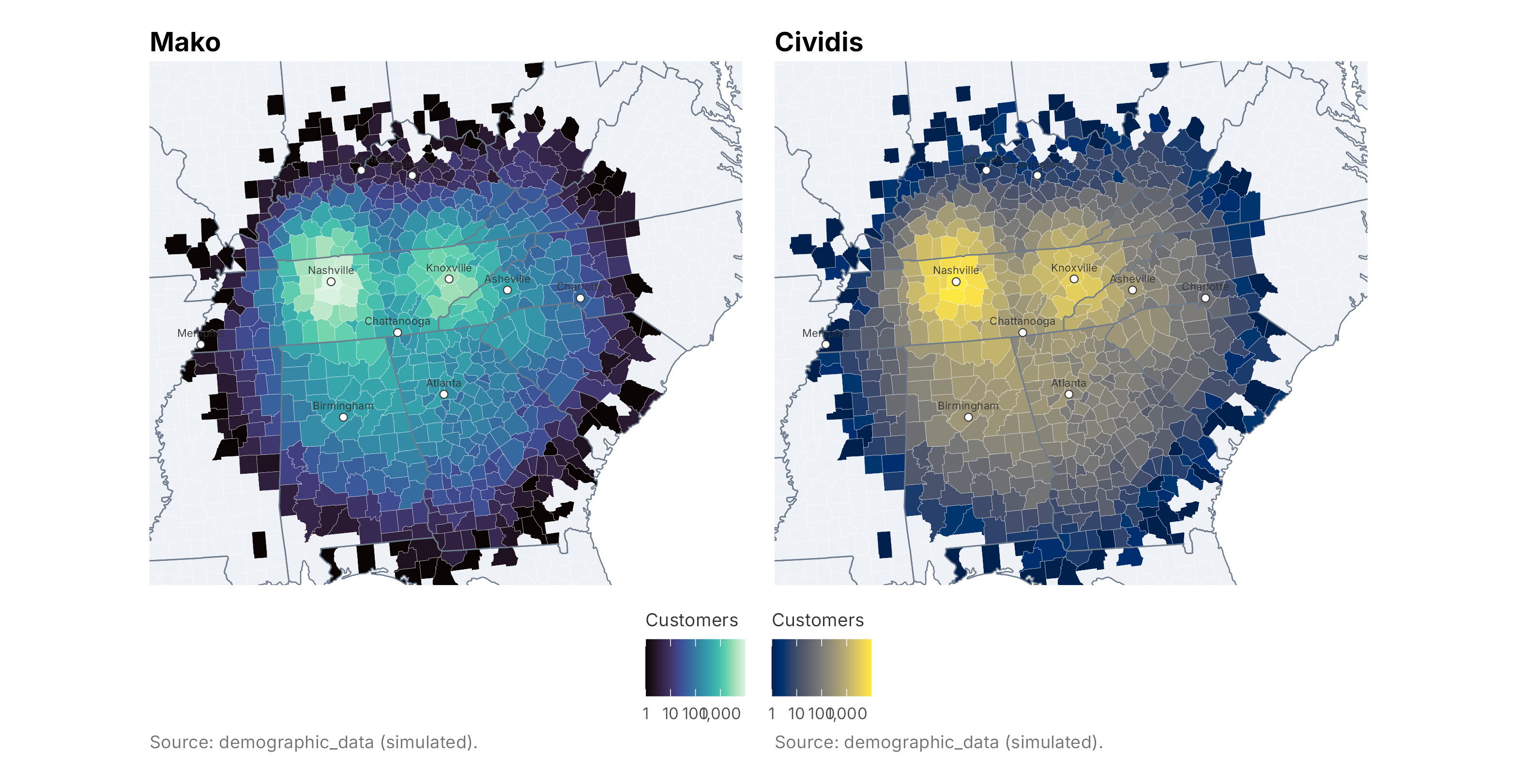
Figure 13.5: The same county-count map with two viridis color schemes
The two tell the same story with a different accent. Both are sequential, and both put their brightest color on the highest values, so in each map the dense cores glow against a darker surround. What differs is the range in between. mako climbs from near-black through deep teal to a pale blue-green, a wide swing in lightness that throws the busy core into sharp relief against the empty edges and makes the map feel high-contrast, almost dramatic. cividis runs from a deep blue up to a warm yellow: a narrower lightness range carried mostly by a shift in hue, so the low end stays a calm, legible blue instead of sinking toward black, and the eye is drawn by the warm color rather than by brightness alone. Neither is more correct; they answer to different jobs.
A few rules of thumb for choosing. Reach for a sequential palette like mako, viridis, or cividis whenever the data runs from low to high, which covers most count and density maps. Prefer cividis when the map may be printed in grayscale or shown to an audience you cannot screen for color vision: it was built on the blue-to-yellow axis that even the most common (red-green) color blindness can still see, and it degrades gracefully to distinct shades of gray. Reach for mako or the flagship viridis when you want the maximum contrast between the crowded core and the empty edges, as on a slide whose whole point is “look how concentrated this is,” because their wider lightness range separates high from low more forcefully. Save diverging palettes (two hues meeting at a neutral middle) for data with a meaningful center, such as over- versus under-index or year-over-year change, and never use a rainbow palette like the old jet: its uneven brightness invents boundaries that are not in the data and it is nearly unreadable for color-blind viewers. Whatever you pick, keep it consistent across a set of maps a reader will compare, and say on the map what the color encodes.
| county | customers |
|---|---|
| tennessee,davidson | 9809 |
| tennessee,williamson | 8784 |
| tennessee,rutherford | 6986 |
| tennessee,sumner | 6718 |
| tennessee,wilson | 6332 |
| tennessee,robertson | 6177 |
A raw count map has a well-known flaw: it partly just shows where lots of people live. A county with more customers may simply be more populous, not more loyal. The honest fix is to normalize by population, customers per thousand residents, which needs a population figure for each county from a source like the Census. We do not carry that here, so treat these count maps as a picture of where the customers are, not of how well the club penetrates each market. That distinction is worth stating out loud to anyone who reads the map.
13.6 Fan catchment: rings around the ballpark
For a single venue, one of the most useful maps answers a blunt question: how far do people travel? Drive time is what actually governs weeknight attendance, and straight-line distance is a decent first proxy for it. We already have each customer’s distance from the ballpark, so we can draw concentric rings and label each with the share of customers who live inside it.
The rings are circles buffered around the ballpark in the equal-area projection, where a mile is a mile in every direction.
ball <- sf::st_sfc(sf::st_point(c(BALL_LON, BALL_LAT)), crs = 4326) |>
  sf::st_transform(EA)

ring_mi  <- c(10, 25, 50, 100, 200)
rings <- do.call(rbind, lapply(ring_mi, function(mi)
  sf::st_sf(mi = mi,
            geometry = sf::st_boundary(sf::st_buffer(ball, mi * 1609.34)))))

# Share of customers inside each ring, from the distance column.
ring_tbl <- data.frame(
  mi    = ring_mi,
  share = sapply(ring_mi, function(mi) mean(demos$distance <= mi))
)

# A label stacked north of the ballpark for each ring.
ball_xy <- sf::st_coordinates(ball)
labels  <- data.frame(
  x     = ball_xy[1],
  y     = ball_xy[2] + ring_mi * 1609.34,
  label = sprintf("%d mi / %.0f%%", ring_mi, 100 * ring_tbl$share)
)

catch_box <- c(xmin = -91.0, xmax = -78.0, ymin = 32.8, ymax = 39.6)

ggplot() +
  geom_sf(data = states_ea, fill = LAND, color = HAIRLINE, linewidth = 0.15) +
  geom_sf(data = build_hex(5), aes(fill = customers), color = NA) +
  geom_sf(data = states_ea, fill = NA, color = STATE_LN, linewidth = 0.3) +
  geom_sf(data = rings, fill = NA, color = "grey15", linewidth = 0.4,
          linetype = "22") +
  add_major_cities() +
  geom_sf(data = ball, shape = 21, fill = plot_palette[6],
          color = "white", size = 2.8, stroke = 0.5) +
  geom_label(data = labels, aes(x = x, y = y, label = label),
             size = 2.4, color = "grey15", fill = "white", alpha = 0.85,
             label.size = 0) +
  fill_blue("Customers\nper hex") +
  crop_to(catch_box) +
  labs(title = "Fan catchment around the ballpark",
       subtitle = "Hex density with 10 / 25 / 50 / 100 / 200-mile rings; labels show the cumulative share of customers",
       caption = "Source: demographic_data (simulated).") +
  theme_map()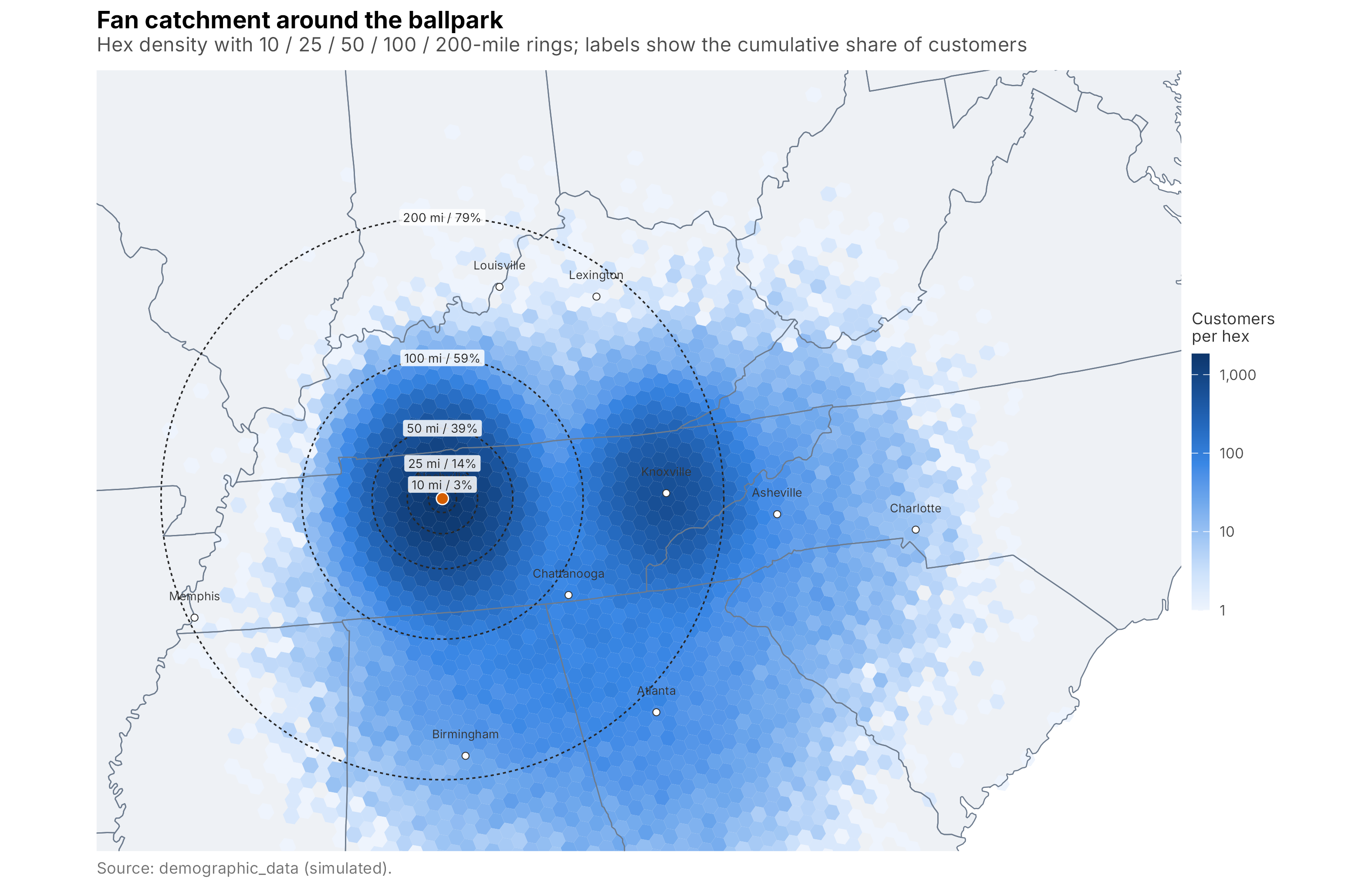
Figure 13.6: Fan catchment: distance rings from the ballpark
The rings quantify the intuition. Only 14% of customers live within 25 miles, but 39% live within 50 and 59% within 100. That shape has direct consequences: an easy weeknight drive reaches only a modest fraction of the base, while a marquee weekend series can plausibly pull from a hundred miles out. It also flags the eastern cluster near Knoxville, well outside the last ring, as a market that behaves differently from the local core and may deserve its own plan. If you can obtain true drive times from a routing service, substitute them for straight-line miles; the map logic does not change.
13.7 Two variables at once: a bivariate map
Every map so far has shaded one variable. Strategy questions are often two-dimensional. Suppose we want to find counties that are both affluent and under-served, the kind of market where there is money to spend but the club has not yet earned its share. That means looking at customer density and household income together.
A bivariate choropleth does this by cutting each variable into three groups, low, medium, high, and assigning each of the nine combinations its own color. We build the two tercile cuts, paste them into a class like "31", and shade with a nine-color palette in which one axis deepens toward blue (density) and the other toward magenta (income).
county_income <- demos |>
  dplyr::group_by(county) |>
  dplyr::summarise(income = mean(hhIncome), .groups = "drop")

bi <- counties_ea |>
  dplyr::left_join(county_income, by = "county") |>
  dplyr::filter(!is.na(customers), !is.na(income))

tercile <- function(x) cut(x, quantile(x, c(0, 1/3, 2/3, 1), na.rm = TRUE),
                           labels = 1:3, include.lowest = TRUE)
bi <- bi |>
  dplyr::mutate(
    dens_c = tercile(customers),
    inc_c  = tercile(income),
    class  = paste0(dens_c, inc_c)
  )

# 3x3 palette: rows = density (low->high), cols = income (low->high).
bipal <- c("11" = "#e8e8e8", "12" = "#dfb0d6", "13" = "#be64ac",
           "21" = "#ace4e4", "22" = "#a5add3", "23" = "#8c62aa",
           "31" = "#5ac8c8", "32" = "#5698b9", "33" = "#3b4994")

legend_df <- expand.grid(income = 1:3, density = 1:3)
legend_df$class <- paste0(legend_df$density, legend_df$income)
bi_legend <- ggplot(legend_df, aes(income, density, fill = class)) +
  geom_tile() +
  scale_fill_manual(values = bipal, guide = "none") +
  coord_fixed() +
  labs(x = "Income high", y = "Density high") +
  theme(axis.title = element_text(size = 7, color = "grey20"),
        axis.text = element_blank(), axis.ticks = element_blank(),
        panel.background = element_blank())

main <- ggplot() +
  geom_sf(data = bi, aes(fill = class), color = HAIRLINE, linewidth = 0.05) +
  geom_sf(data = states_ea, fill = NA, color = STATE_LN, linewidth = 0.3) +
  add_major_cities() +
  scale_fill_manual(values = bipal, na.value = LAND, guide = "none") +
  crop_to(region_box) +
  labs(title = "Customer density and household income by county",
       subtitle = "Deep blue = strong on both; magenta = affluent but thin (prospecting targets)",
       caption = "Source: demographic_data (simulated). Income is a relative index.") +
  theme_map()

main + patchwork::inset_element(bi_legend, left = 0.0, bottom = 0.0,
                               right = 0.28, top = 0.32, align_to = "panel")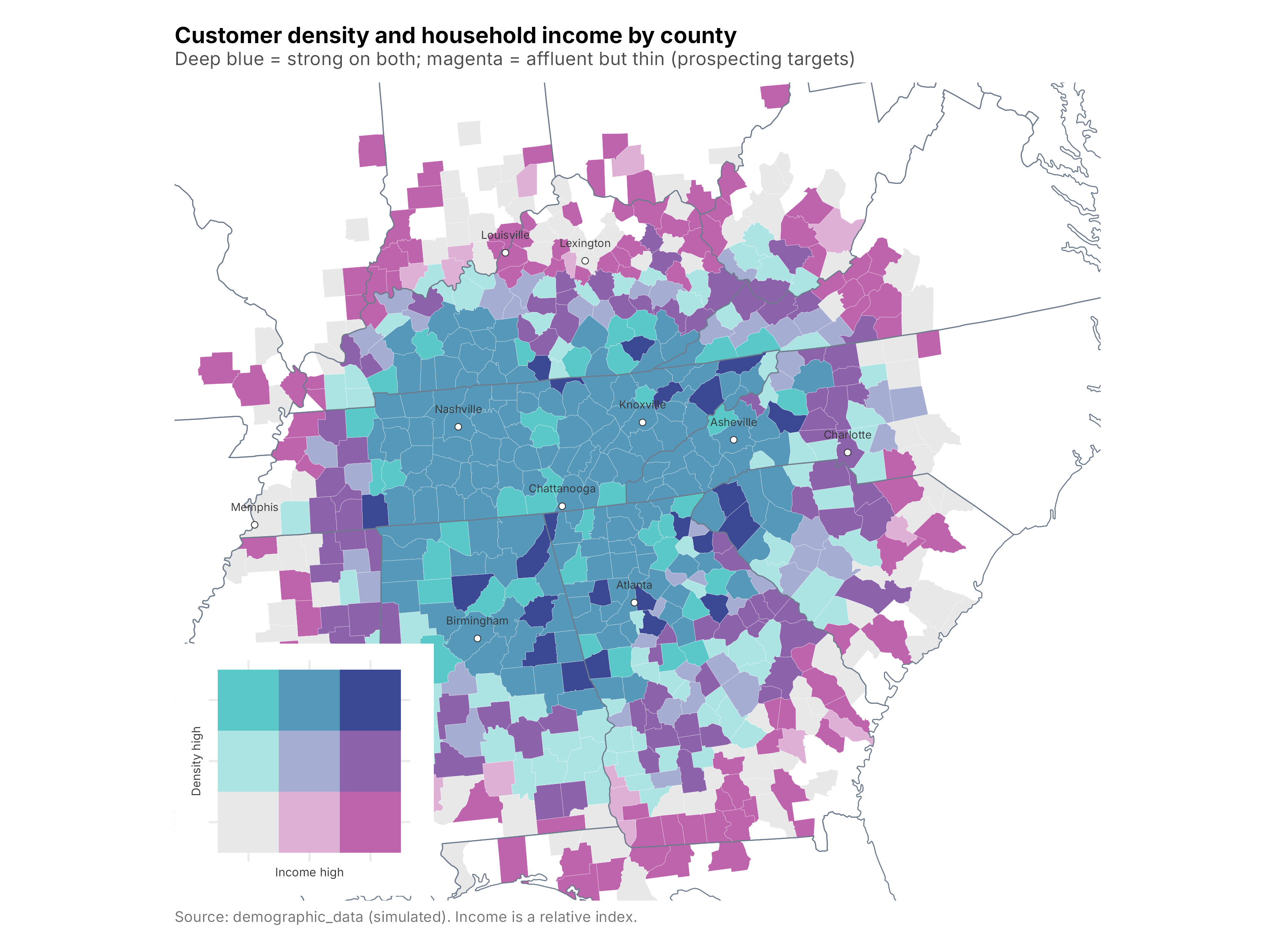
Figure 13.7: Customer density and household income together
We composed the map and its custom legend with patchwork (Pedersen 2025), which lays out ggplot2 objects together. Read the map by color: deep blue counties are strong on both dimensions, the club’s stronghold. The magenta counties are the interesting ones, affluent but thin on customers, exactly the profile a group-sales or direct-mail campaign should test first. A bivariate map will not tell you why a county is under-served, but it is very good at turning a two-part question into a single picture a room full of people can act on. Remember the earlier caveat: without population normalization these are density and income, not penetration, so treat the targets as hypotheses to validate, not conclusions.
13.8 Caveats and going further
A few things are worth keeping in mind.
- A map is persuasive, which cuts both ways. Color choices, class breaks, and whether you normalize by population can flip the story. Log scales tame skew but can hide it; terciles are relative to the data in front of you. State your choices on the map.
- Projections matter. We used an equal-area CRS so hexes and rings are comparable; a different projection would distort areas or distances. Match the projection to the question.
- This data is simulated. The clusters are clean by construction. Real customer geography is messier, with bad geocodes, apartment complexes that swallow thousands of accounts at one point, and PO boxes that land nowhere near the customer. Inspect before you map.
-
R can do more. It can geocode addresses and pull true drive times from routing APIs (both usually need a key and are rate-limited), read and write the shapefiles and GeoJSON your GIS team uses, and make interactive slippy maps with
leaflet. Thesffoundation is the same underneath.
13.9 Key concepts and chapter summary
Geography is one of the highest-value, lowest-effort views a club has, and the coordinates are usually already sitting in the customer file. We built five maps, each answering a different question:
- A point map for a fast first look at where customers are.
- H3 hexagonal binning to quantify density and zoom from region to metro.
- A county choropleth to shade areas a decision is made on, joining data to geography by name.
- Catchment rings to measure how far fans travel from the venue.
- A bivariate choropleth to combine two variables, density and income, into one targeting view.
A few lessons carry beyond the code:
-
Use
sf. The whole modern R spatial ecosystem is built on it, and it keeps mapping inside your reproducible analysis rather than a separate tool. - Pick the right unit. Invented cells (hexes) show raw density well; named areas (counties) connect to decisions and budgets.
- Normalize before you claim penetration. A count map partly just shows population. Say so, and bring in population data before calling a market under-served.
- Design honestly. Projection, color, and class breaks are analytical choices, not decoration.
Chapter 14 steps back from the individual techniques to reflect on how the pieces of the book fit together into a working analytics practice.